
Color matters: how to get it right in your home
/Wrenda Goodwyn • special to the Fort Myers News-Press/USA Today Network • Feb. 4, 2023
Creating a spectacular space in your home doesn’t just happen. It takes thought, effort, planning and careful implementation for a quality result. This is especially true when coming up with a color plan.
It’s far from easy. It’s complicated. It’s not necessarily about your favorite color. It’s why home interior professionals study it for years and most are like me and don’t leave the house without a fan deck in their hand. We are passionate about color. Color is everything.
As a Fort Myers interior decorator, my most requested service is selecting color and creating personalized color palettes for the home. It’s the most difficult part of decorating for many homeowners and there are good reasons. The number one reason being the approach. It’s usually all wrong and results in mistakes and frustration.

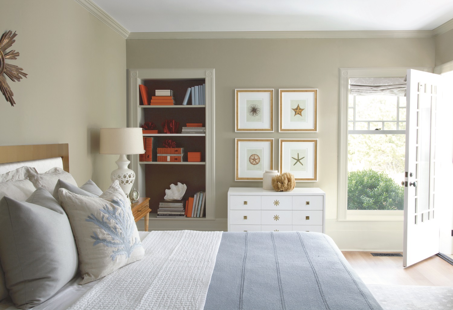
Creating a spectacular space in your home doesn’t just happen. It takes thought, effort, planning and careful implementation for a quality result. This is especially true when coming up with a color plan. Before you head out to pick up color swatches, come up with a plan that considers flooring, light, furnishings and upholstery throughout the home. Photo: Benjamin Moore
Most rush out to a big box store, grab a hundred color swatches (all in their favorite colors), take them home, hold the one-inch color swatch up to their existing paint color, make a decision, call the painter and it all begins. And then wonder why it doesn’t look just right.
Trends and changes
Although I always recommend following what you love and a more timeless approach to home decorating, color trends are always fun and there are lots of changes in color choices.

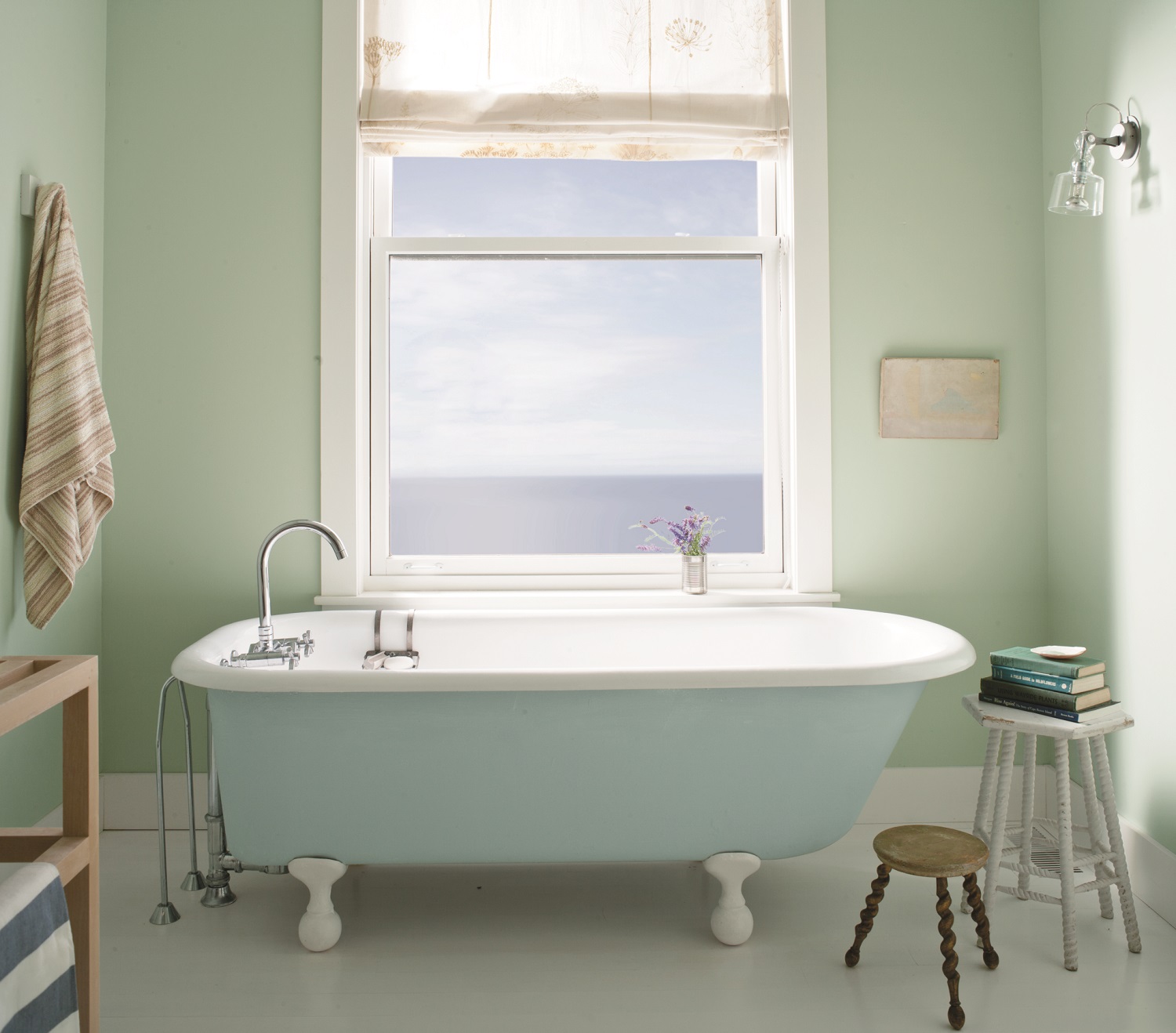
Timeless and classic. A white bathroom with walls in Benjamin Moore’s Ice Mist in matte and wainscoting in White Diamond matte. Aura Bath & Spa. Photo: Benjamin Moore.
• Overall we are seeing warmer colors. Cozy and comfort seem to be what we are craving right now.
• Lots of beautiful earth tones. Be careful of too much of a good thing. Remember how long it took to escape the Tuscan trend.
• Reds, oranges, yellows.
• Neutrals warmed up with yellows, blues and greens. This is a popular choice in Southwest Florida homes.
• Moody hues on walls in darker tones. And lots of navy for kitchen cabinets.

Moody colors are popular such as Benjamin Moore’s Charcoal Slate (walls in matte) and Atrium White (ceiling in matte), trim in semi-gloss. All are Aura Interior Paint. Photo: Benjamin Moore.
Timeless and classic
• White for kitchens and bathrooms.
• Moldings for the entire home. These classic touches give a room what it needs to carry off all-white or dark colors.
Rule #1
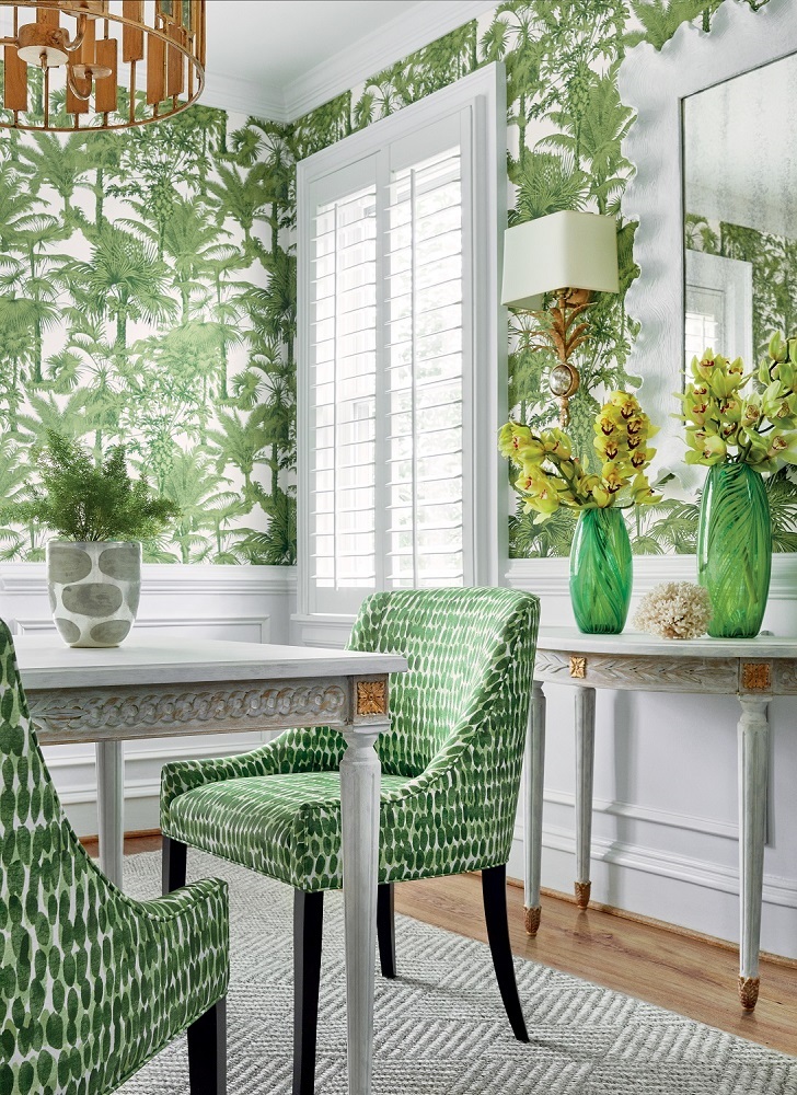
When we speak of color and color palettes, we are not suggesting that color only be considered for walls. Your color palette should incorporate the entire look of your home. If your primary color in your living spaces is neutral, the color palette should incorporate other colors throughout to keep it from being boring.
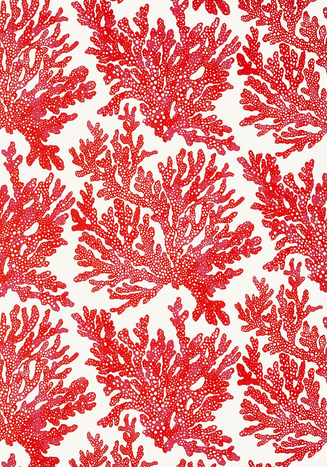
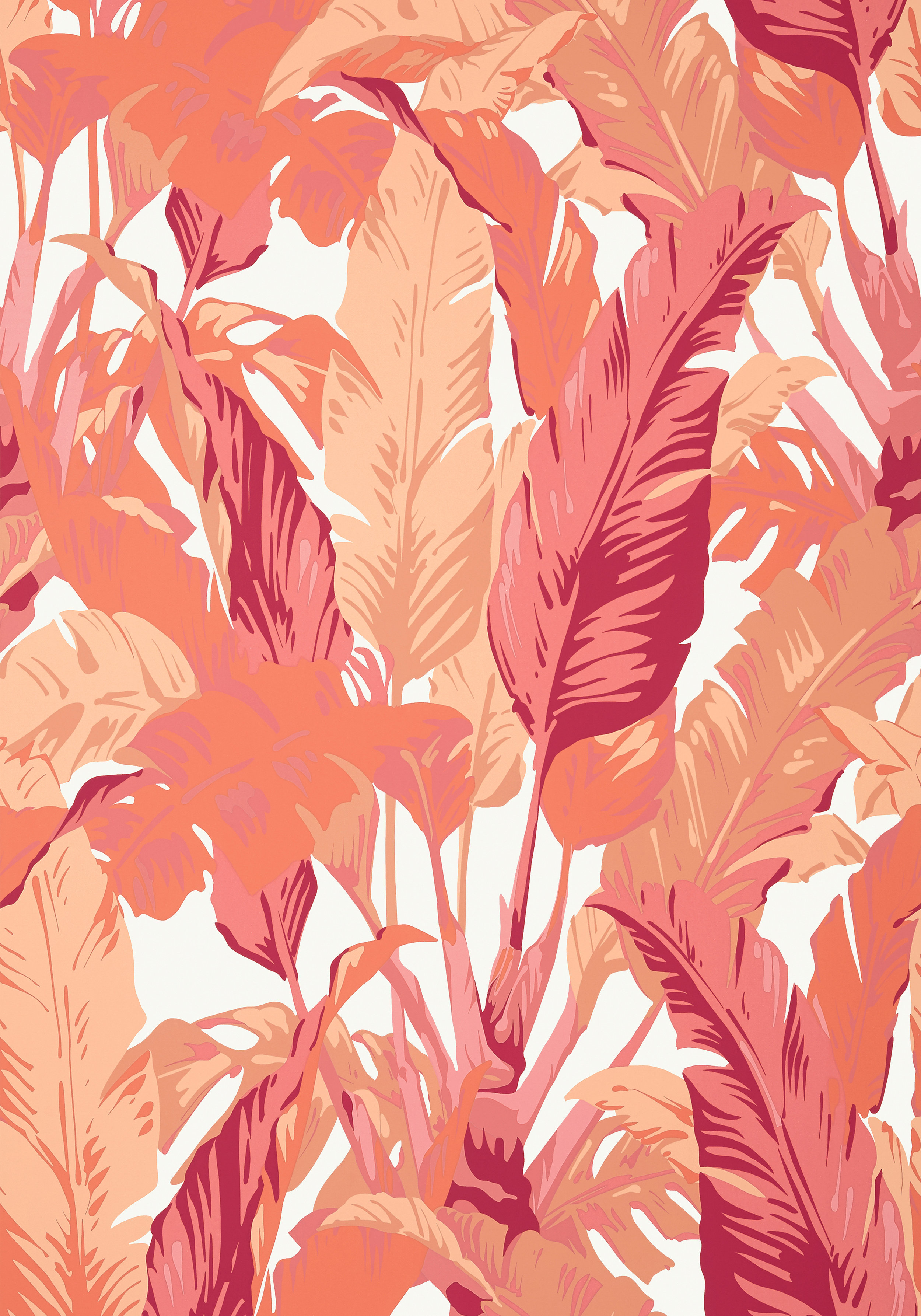
An example is yellow. We are seeing this color return and it is everywhere. But let’s face it: yellow is a tough wall color if you don’t want to tire of it soon. So, work yellow into your palette with towels, linens, fabric, wall treatments and accessories.
And this really goes for any color that you fall in love with. Just because you saw that dark blue in a magazine and you want to try it on your walls, think about it. Consider lighting, architectural features, furnishings, trims and how you use the room before you paint. Most of these rooms in magazines are decorated from top to bottom with custom trims and architectural features. It simply will not look the same in a plain room.
So, what do we do?
Incorporate these beautiful splashes of color throughout your home in other ways. Here are a few:
• Try the color on a ceiling. I have been doing this in homes for years and it gives a splash of color without committing it to the entire room.
• Paint shelves and bookcases in a color against a neutral background. Or go monochromatic with everything in the same color.
• Use colors from your palette in rugs, pillows, window treatments, headboards, upholstery for sofa, and chairs, artwork, mural or wallcovering.
Why is color so important?
• It updates your home without spending a fortune.
• Pulls the space together.
• Makes your home look clean and fresh.
• Color creates a personalized look for your home.
• It makes you happy!
A few more tips
ALL color has undertones. This is where the mistakes are made. If your sofa (or flooring or counter tops) has green/beige undertones and you pick a pinky beige paint color for walls, you will not be happy. This is where a professional can help.
• Think about the rest of your home. Color needs to coordinate throughout. A good rule that I follow: No more than three paint colors in the home.
• What works: I like to select more neutrals for the main areas and incorporate ceiling and trim colors. Bathrooms and bedrooms lend themselves to accent colors.
Wrenda Goodwyn is a Southwest Florida interior decorator, A.S.I.D. associate and gold member of the Interior Redecorators Network. She helps homeowners throughout Southwest Florida with timeless, affordable ways to create beautiful spaces and solve decorating problems. Her articles appear the first Saturday of each month. For more information, visit her website at spectacularspaces.com. Call her at 239-850-5800 or e-mail wrenda@spectacularspaces.com. For more decorating tips, articles and photos, visit spectacularspaces.com/blog