
A crocodile, inspiration and coastal vibes at Kips Bay decorator showhouse
/Wrenda Goodwyn • special to the Fort Myers News-Press/USA Today Network • March 18, 2023

This year’s Kip’s Bay Decorator Showhouse in West Palm Beach is filled with design inspiration that begins with the woven crocodile that greets you in the foyer to the 21 rooms that are jam-packed with the latest and most beautiful designs and products.
As a Southwest Florida interior decorator, I came away with more tips, trends and ideas for my clients than ever before when visiting a showhouse. From paint colors that blend neutrals with brights to ceiling treatments and outrageously beautiful lighting and unique arrangement of accessories, to creating cozy spaces in large rooms and outdoor spaces.

Amanda Lindroth’s great room features multiple areas done in a comfortable scale despite the large size of the room. The room is also packed with ideas for lighting, furnishings and accessories. Photo: Nickolas Sargent
The 9,000-square-foot, six-bedroom, Mediterranean-style estate is influenced by its location on the Intracoastal Waterway. High-end interior designers and architects (21 of them) from all over the country transformed a blank canvas into a maximalist dream home with a coastal vibe throughout.

A Schumacher crocodile makes its way through the entry with a toothy grin and seems to be saying “walk this way” as it sits on a beautiful hand-loomed black runner with custom saw- toothed edges. Photo: Nickolas Sargent
Built in 2007, among its stand-out features: a chef’s kitchen, covered loggia, a led-lit bed frame in marble. There is also the use of lots of texture with neutral tones; ceilings covered in color, wallpaper and trellises; a pretty laundry room with artwork, skirting and honed countertops; eclectic mixing of styles and colors.
A few tips and takeaways:
Coastal is returning in a big way. It never really left but it’s so well done in this home that it can work anywhere, not just on the beach. If you are looking for tips to add just a sprinkling of coastal to your Southwest Florida home, check out my previous article.
Layered rugs. “Walk this way,” says the Schumacher crocodile greeting visitors in the entry. He is layered on top of a black runner with custom scalloped edges. Lots of layering of rugs in this home. I am a bit lukewarm to this idea in general but this crocodile has style!
Curved sofas in narrow rooms. These are pretty in any room but solve a design dilemma if the room is narrow. Rather than smaller pieces, go full-size and curved.
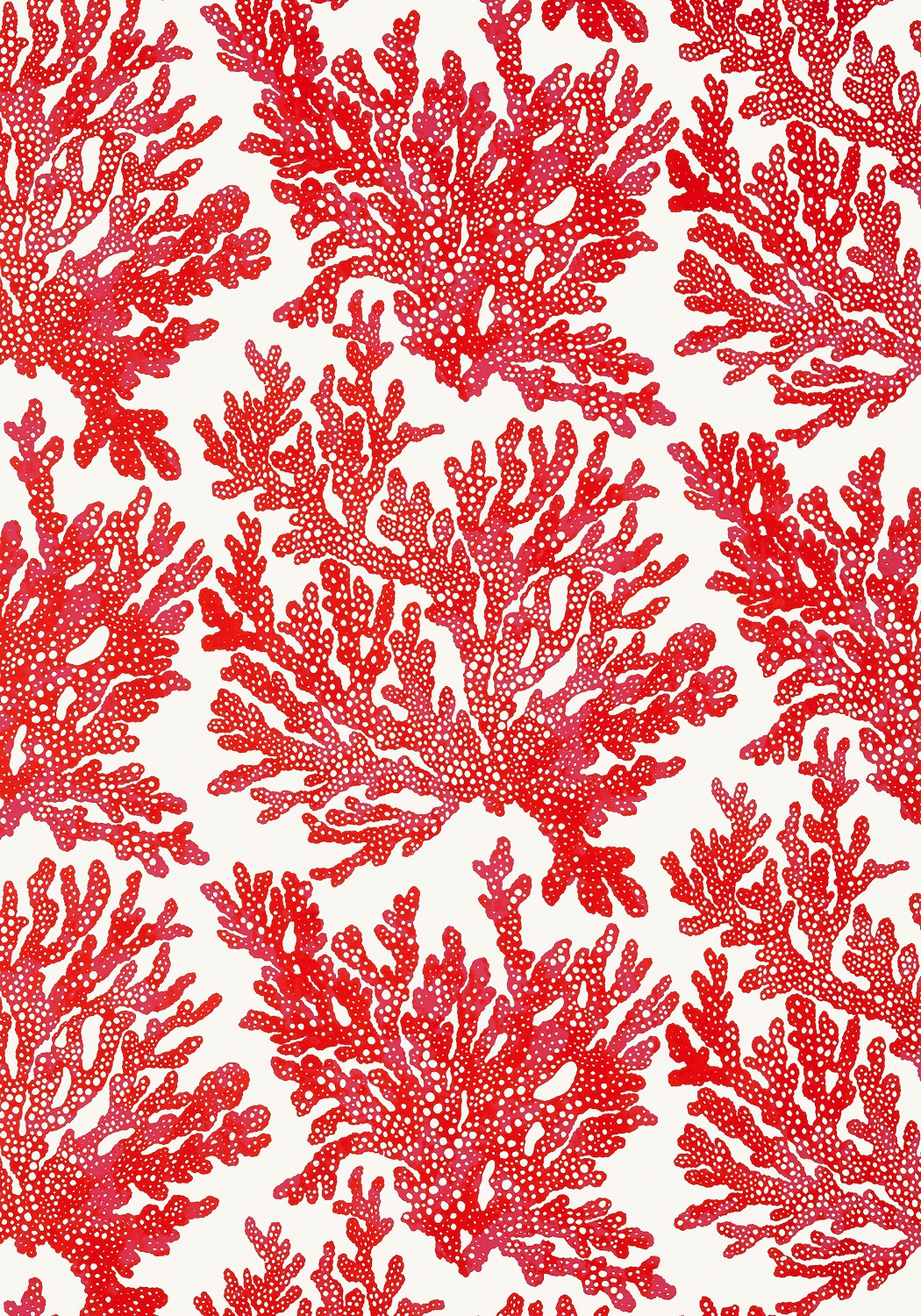
If it’s neutral, add texture! Rooms in showhouses are always filled from top to bottom and this one is no exception. But it works. My favorite room was the Cocoa Lounge by Palm Beach designer Danielle Rollins. The focal point, well there were two, was the gigantic shell mirror over the sofa done by Stephanie Ferguson. The second is the armoire converted into a mirrored “barmoire.”
The comfortable furniture arrangement against a neutral backdrop is enhanced by the form and textures that dominate the room. Rattan, jute, coral, shells (lots of shells), linen and silk come together for a look that works. And it goes along with my thinking that you should always surround yourself with lots of what you love.

Designer Lucy Doswell created a functional space in her library. Done in dark green, it is perfect for serious work and transfers into a comfortable setting for evening relaxation and cocktails when the work day is done.
Home offices that work overtime. Why have a room that serves one function when it can comfortably accommodate two? Designer Lucy Doswell created a functional space in her library. Done in dark green, it is perfect for serious work and transfers into a comfortable setting for evening relaxation and cocktails when the work day is done.
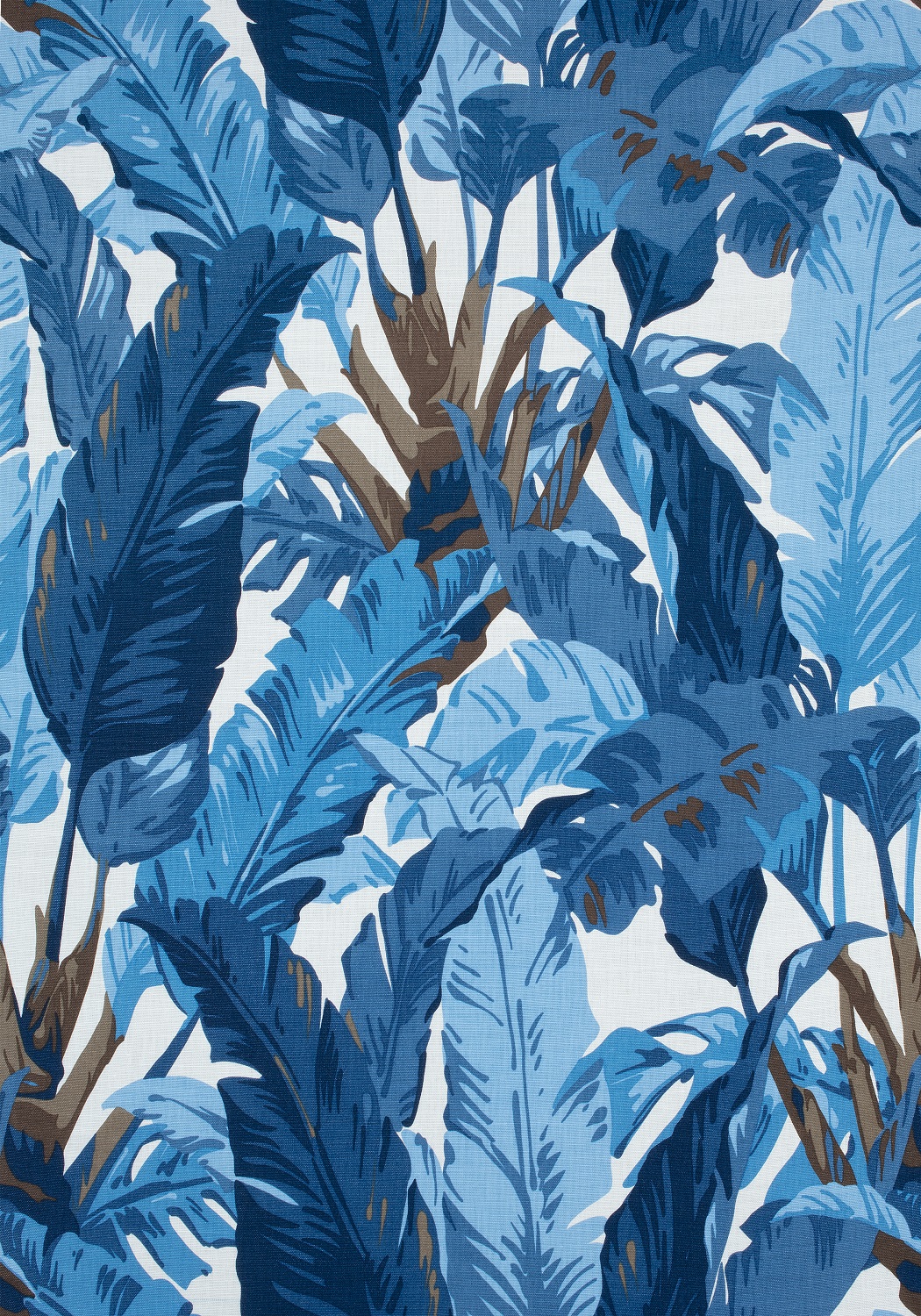
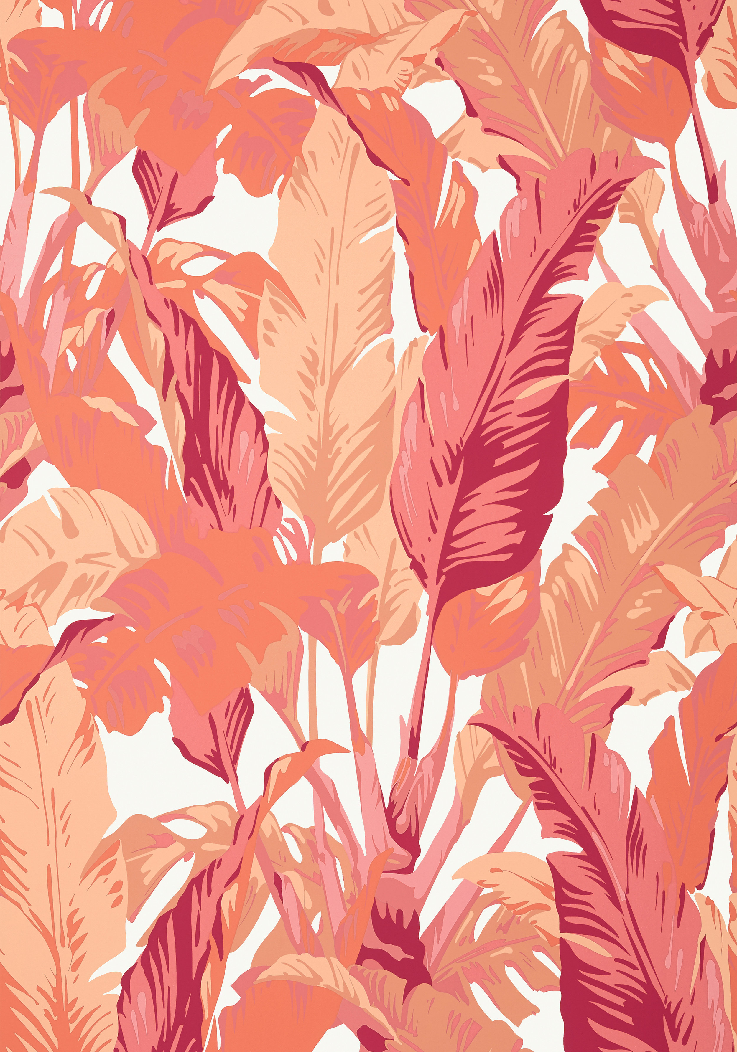
Welcome to the jungle. Designer Mabley Handler curated an exotic guest bedroom with a saturated pattern of mauve and green. Trellis ceiling. Customized mural wall covering with plants and palms in soft melon, gray, sage and cream. A writing desk, vintage rattan chair, gray woven canopy bed and leafy chandelier in vintage brass come together for the bespoke details of the room.

“Welcome to the Jungle,” Mabley Handler’s bedroom uses a Gracie “Tropics” wall mural with the palms and plants colored in a neutral Florida palette of soft grey, sage green, and cream. The trellis and coffered ceiling draw the eye up and emphasize the layering of the room that includes a grey woven canopy bed, vintage rattan armchair and vintage and eclectic accessories curated in a mix that works! Photo: Nickolas Sargent
I will likely never have a marble bedframe with led lighting or a crocodile crawling down my hallway but it’s fun to see it and appreciate the work of these designers. And to discover new ideas for our homes. Well, I did look up the cost of the crocodile because you never know!

“Room with a View” by Designer Honey Collins spans the full width of the rear of the home and overlooks the pool, lush gardens and Intracoastal below. The covered awning creates an outdoor room with a sense of privacy that is loosely inspired by the private loggias and verandas of Palm Beach Island. Photo: Nickolas Sargent
If you would like to see the showhouse, hurry because you have until the end of the day tomorrow. Check details and tickets at www.kipsbaydecoratorshowhouse.org
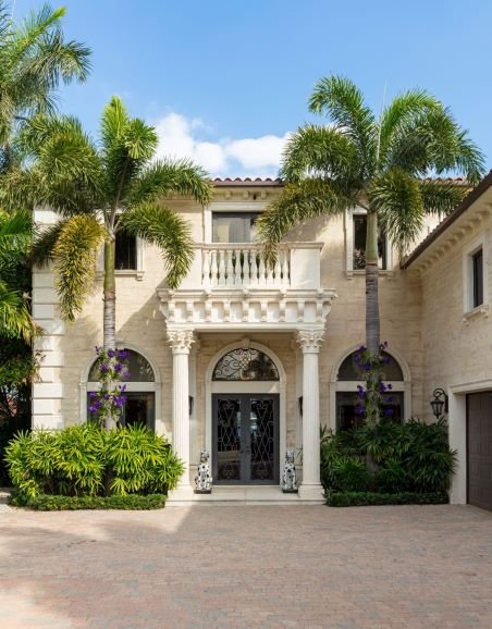
The Mediterranean-style property in Norwood Shores is the 6th Kips Bay Decorator Show House in Palm Beach. The annual event benefits Kips Bay Boys and Girls Clubs and the Boys and Girls Clubs of Palm Beach County. Photo: Nickolas Sargent
And if you would like to see more photos of the home, visit my blog.
Wrenda Goodwyn is a Southwest Florida interior decorator, A.S.I.D. associate and gold member of the Interior Redecorators Network. She helps homeowners throughout Southwest Florida with timeless, affordable ways to create beautiful spaces and solve decorating problems. Her articles appear the first Saturday of each month. For more information, visit her website at spectacularspaces.com. Call her at 239-850-5800 or e-mail wrenda@spectacularspaces.com. For more decorating tips, articles and photos, visit spectacularspaces.com/blog