
Home renovation survival tips
/Wrenda Goodwyn • special to the Fort Myers News-Press • October 6, 2018
My dream was to find the perfect home that needed just a tiny bit of cosmetic work to make it mine. I had done major renovations in the past and did not want to go down that road again.
Keep it simple and easy. That was my mantra. And gorgeous. With everything perfect. After all, I am a Southwest Florida interior decorator and I know how to make anything pretty. Really pretty. And functional. Plus, I have all the tools at my fingertips so this should be a snap.
Wrong.
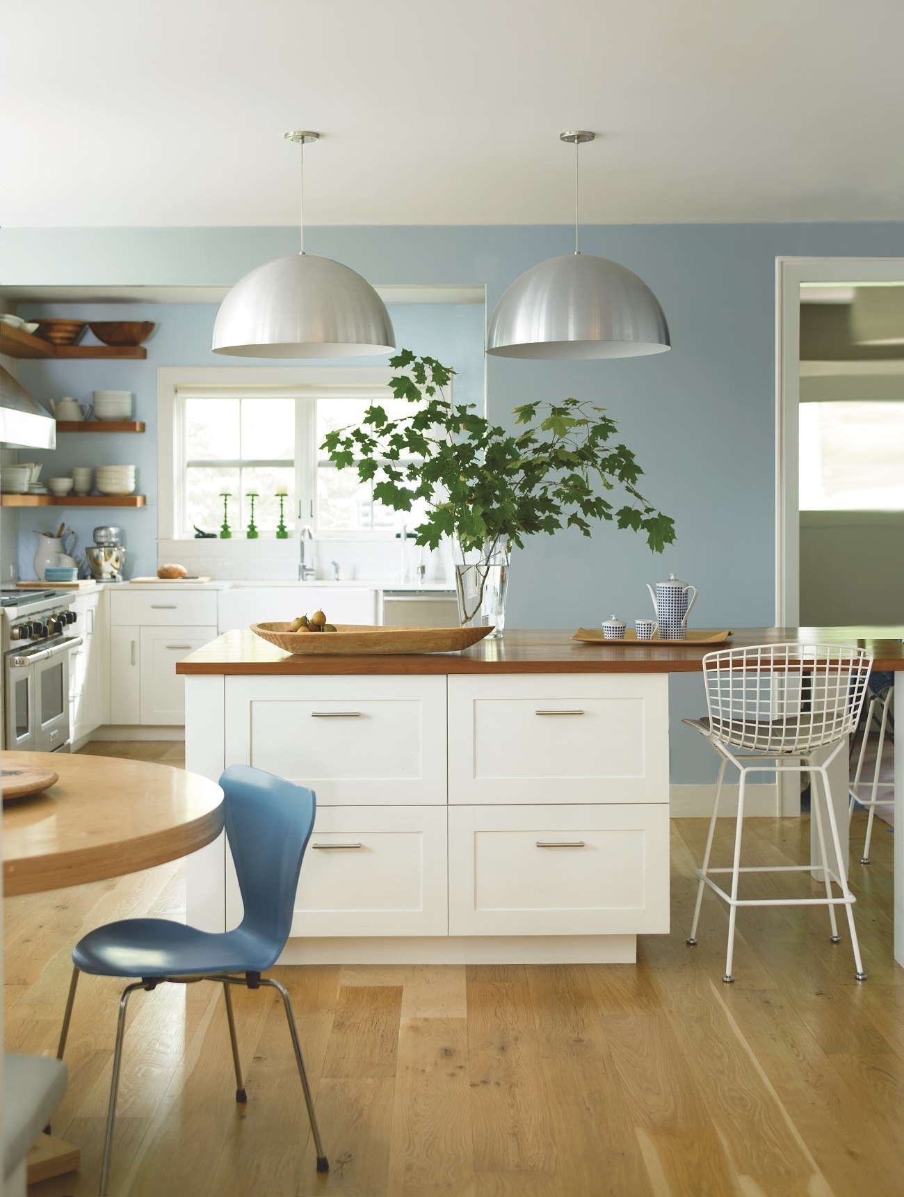
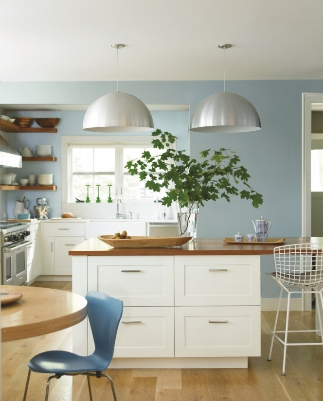
There is a lot to consider in a kitchen renovation: floors, walls, lighting, cabinets. Great light, white cabinets and beautiful blues are the focus in this coastal-inspired kitchen. Near wall in smoke 2122-40. Far wall in Caribbean Mist 2061-70. Cabinets in Ice Mist OC-67. Photo: Benjamin Moore.
Remember “Under the Tuscan Sun?”
Although it was a romantic comedy, it could be a home renovation documentary. It’s about a writer who says goodbye to her past and buys a 300-year-old villa in Tuscany. It’s also about her hot new love interest and is set against the backdrop of the beautiful Tuscan countryside. We have all had a similar dream, right?
But it (the movie) is really about the house.
Like “Under the Tuscan Sun,” whether you’re remodeling your bedroom or a bath, knocking out a few walls, creating a new kitchen from start to finish or renovating the entire home, it’s a fairly miserable experience. There is just no way to sugarcoat it.
It’s dirty, stressful and expensive. You have very little control. You are at the mercy of your contractor and the subs that may or may not show up for work. Unexpected problems arise that delay the project and cost. It turns your home and your life upside down. Until the project is finished.
The bottom line: you just have to live through it and hope for the best.
And having just gone through the experience myself, I have a few do’s, don’ts and survival tips that can help.
Renovation don’ts
Don’t cry or panic. It will get better.
Don’t believe the home shows. As fun as they are, they just don’t present the reality of the cost and experience of a home renovation. You know that.
Don’t stay in the house if it’s a major renovation. This is not always possible but moving out for the duration can save your sanity.
Don’t try to do it yourself. Call in the professionals.
Don’t take on a renovation or major remodel if you just aren’t up to it. Make a few cosmetic changes to the room that will enable you to live with it. New paint. New window treatments. A new rug. Maybe new kitchen countertops. Pick what bothers you most and let that be your focus. You might be surprised at the big difference a few small changes make.

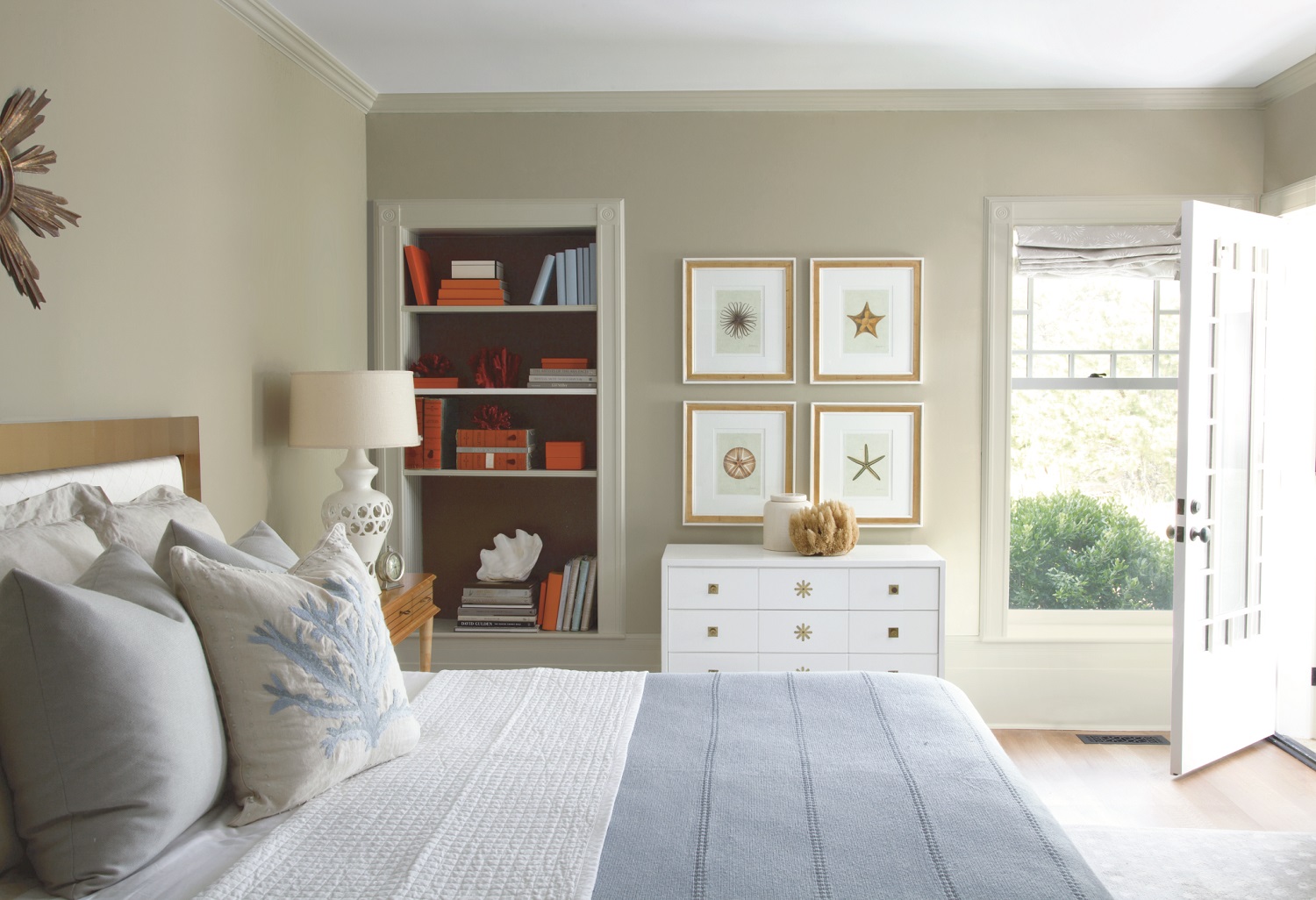
Don’t embark on a renovation or major remodel if you just aren’t up to it. Make a few cosmetic changes to the room that will enable you to live with it. Pick what bothers you most and let that be your focus. A few small changes make a big difference. This Pottery Barn Harper upholstered bed, along with new furniture and artwork will totally change a bedroom. Photo: Pottery Barn.
Renovation do’s
Be patient. This won’t last forever.
Come up with a plan before your first meeting with a contractor. They can’t read your mind and you need to be able to tell them exactly what you need/want. Think about the little things that matter: light switches in the right place, fans, chandeliers, electrical outlets. This is your chance to get it just right.
Consider your lifestyle if you are redoing a floorplan. Traffic flow. Feeling of the home. Color. Is your taste traditional, contemporary, casual, coastal, transitional?
Start from the ground and work your way up with your plan: flooring, walls, furniture, lighting.
Establish a budget before the first meeting. And know that there will always be a few unexpected surprises that will add dollars so plan on it.
Hire an interior decorator or designer to get you started on the right path. They can look at the project and tell you what is doable, practical and the best use of your money for resale. They will also help you to make your vision for your home a reality.
Interview several contractors. Visit homes they have done and talk to the owners. Select the one that you feel will be the best fit for this short or long term relationship.

Renovating or adding a powder room? There are a lot of details to consider. Fixtures, space planning, color. Design element for this small bath is Pottery Barn’s modern farmhouse sink. Photo: Pottery Barn.
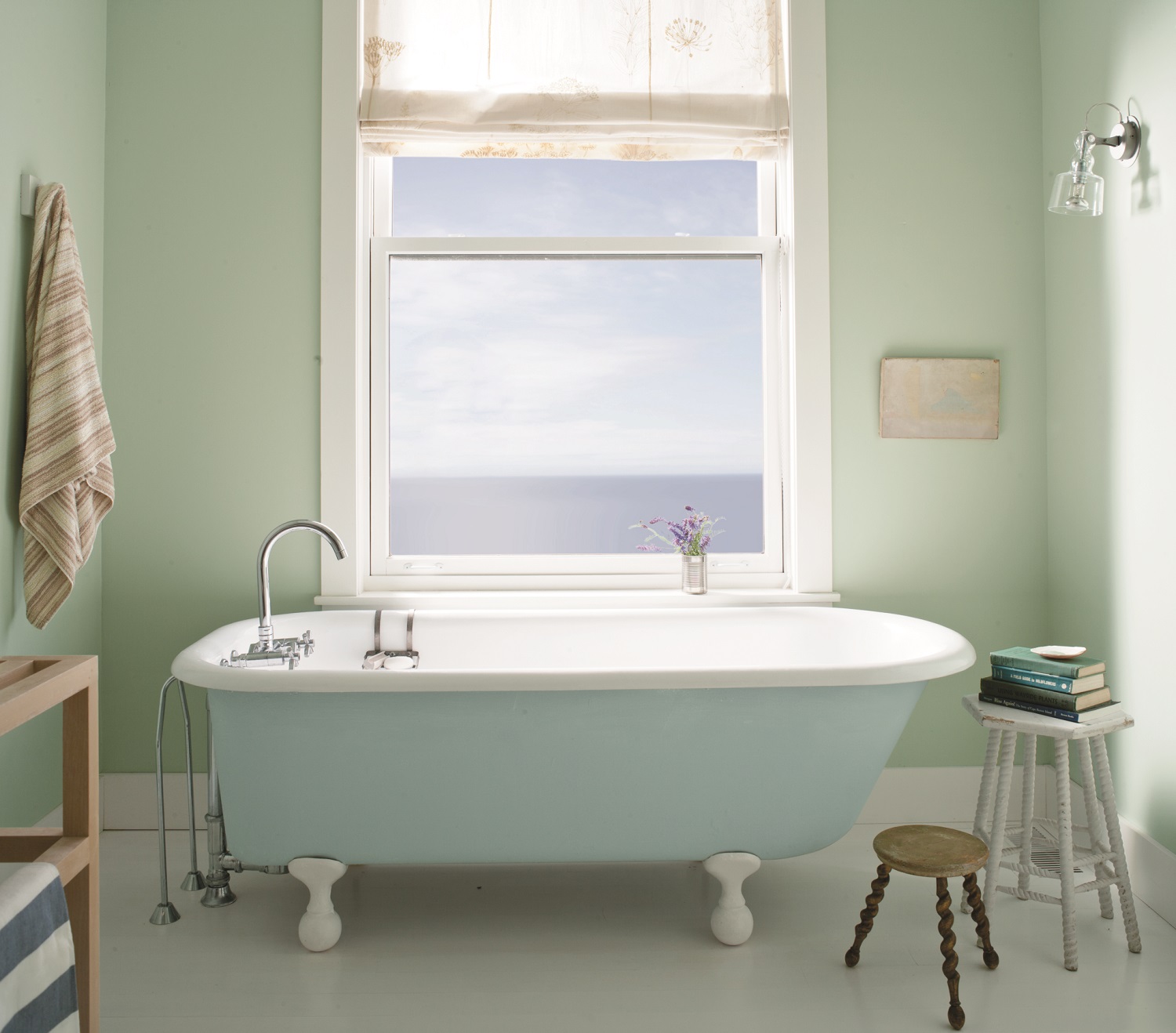
Be flexible. And be willing to make compromises. That’s just the reality of a renovation. Sure, you wanted that beautiful, free standing bath tub sitting in the middle of your new master bathroom. But the plumber said it would cost a fortune. So, against the wall will be just fine.
If you are living in the home during a remodel or renovation, set aside one area that is your sanctuary from the noise and dust. Like a master bedroom where you can close the door and think.
Most important: be patient. It’s worth the wait and the disruption to get the home that you want.
Wrenda Goodwyn is a Southwest Florida interior decorator, A.S.I.D. associate and certified gold member of the Interior Redecorators Network. She has helped homeowners throughout Southwest Florida with timeless, affordable ways to create beautiful spaces and to solve decorating problems. Her article appears the first Saturday of each month. For more information visit her website at spectacularspaces.com. Call her at 949-1808 or e-mail wrenda@spectacularspaces.com. For more decorating tips, articles and photos, visit spectacularspaces.com/blog