
Pantone color of the year: peachy, fun and bold
/
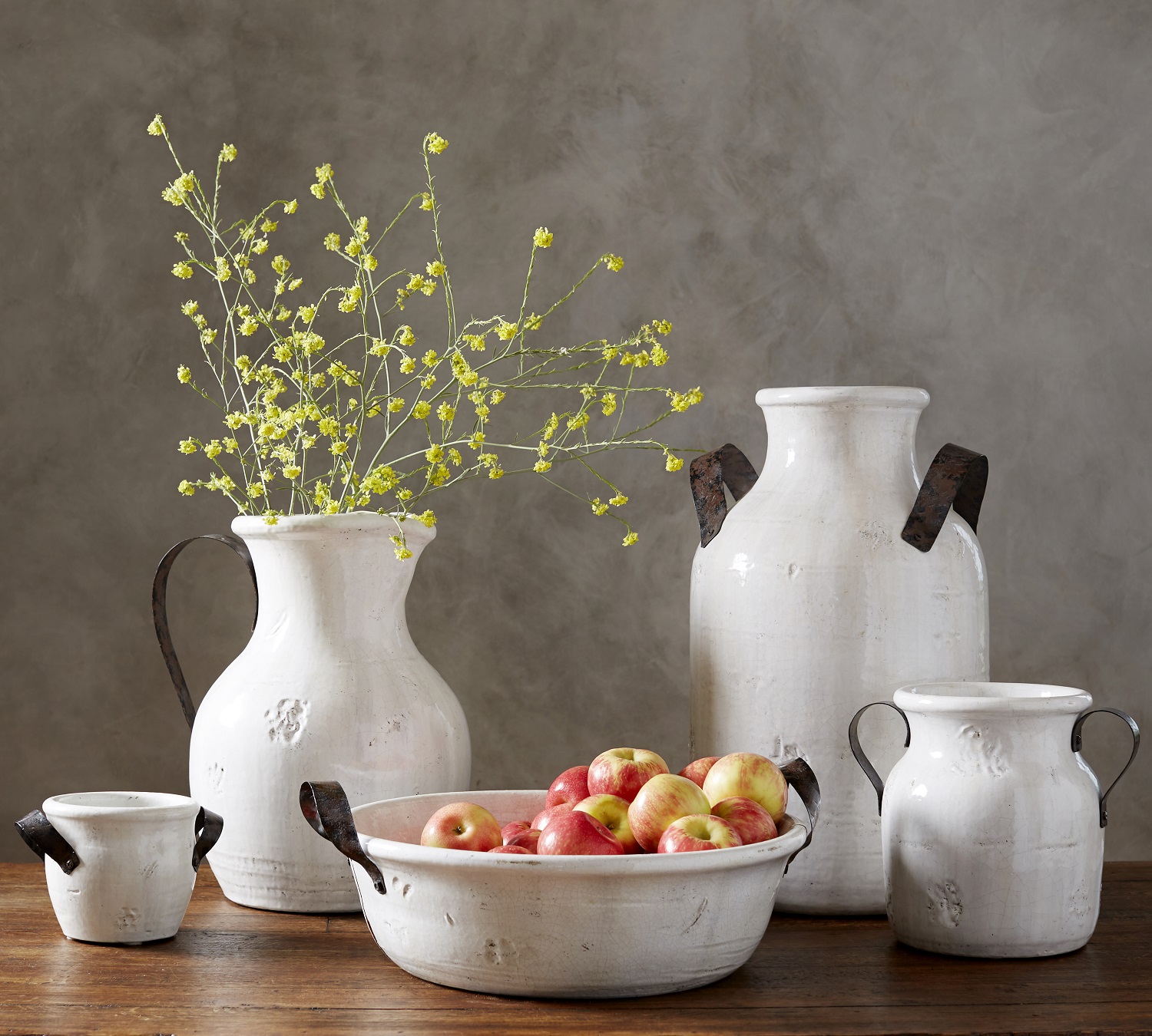
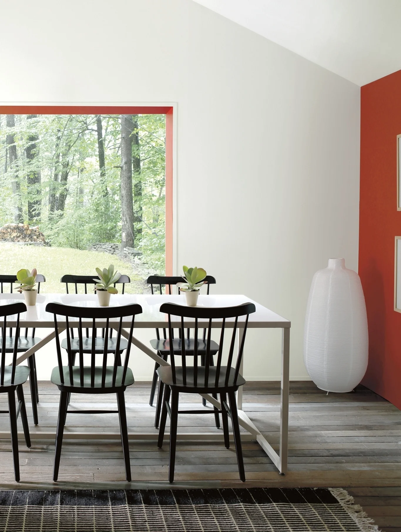
Kravet celebrates Living Coral by showcasing an inspiring line of fabrics at www.Kravet.com. Curated furnishings and accessories in the color are available at www.curatedkravet.com/us/ and offer lots of great ideas for working the color into an existing palette. Photo: Kravet.
Wrenda Goodwyn • special to the Fort Myers News-Press • December 15, 2018
It’s always fun to take a break this time of year, forget the red and green for a few minutes and check out the Pantone Color of the Year (2019).
If you’ve read my column for any amount of time, you know that as a Southwest Florida interior decorator, I recommend that my clients not follow trends. We want beautiful, sensible, timeless interior design that reflects what you love.
But let’s face it. Color trends are just plain fun. And I can never resist this one. Pantone, provides professional color standards and digital solutions for the design industry. This includes beauty products, home interiors and furnishings, fashion and accessories, design, packaging and more. You always see the selected color a lot. Everywhere. Think: fashion runways.
So get ready!
This year’s selection: Pantone 16-1546 Living Coral.
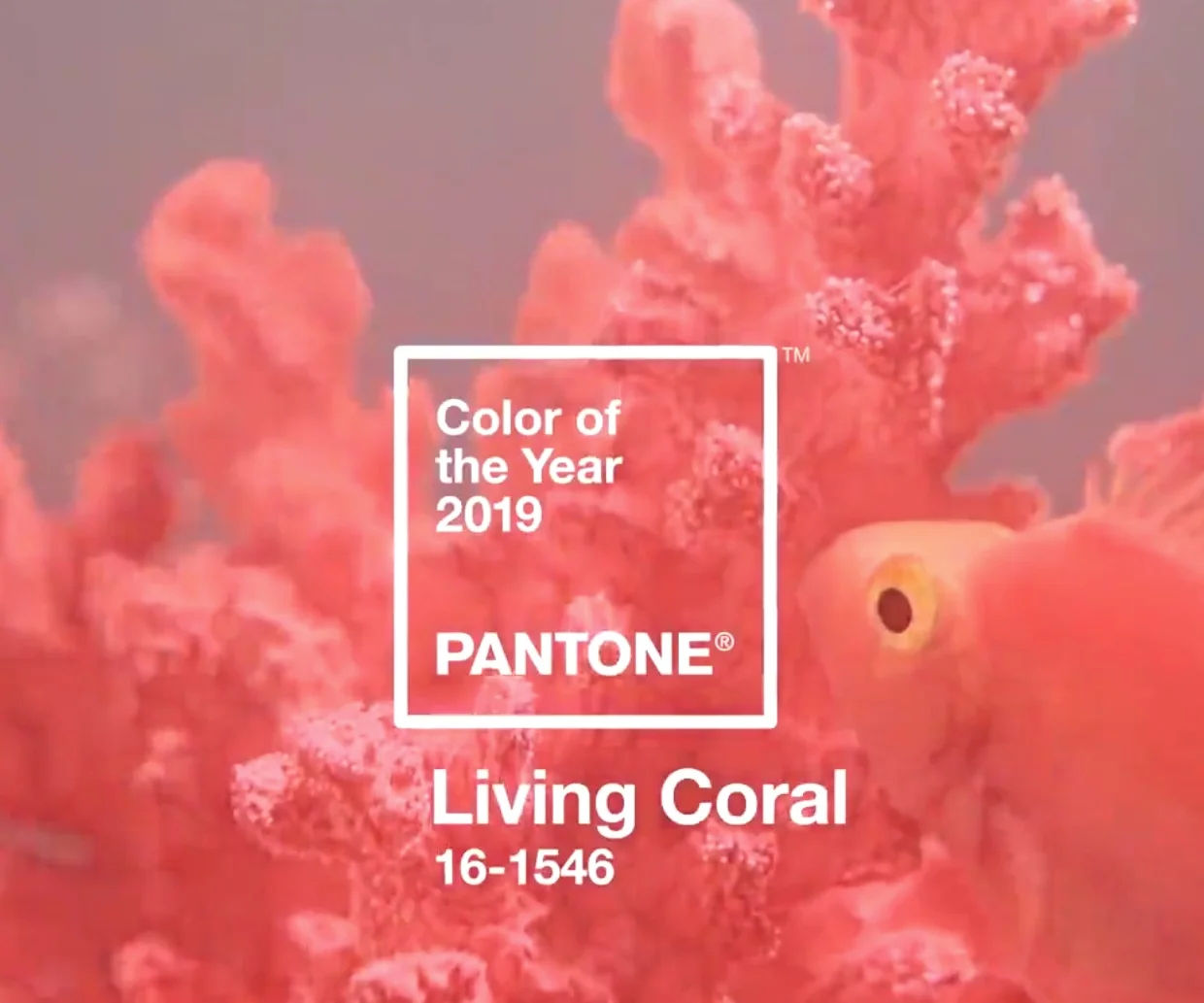
A shade of orange with a golden undertone, Pantone Color of the Year (2019): Living Coral. Photo: Pantone.
Pantone describes it as “an animating and life-affirming shade of orange with a golden undertone. We get energy from nature. Just as coral reefs are a source of sustenance and shelter to sea life, vibrant yet mellow, Living Coral embraces us with warmth and nourishment to provide comfort and buoyancy in our continually shifting environment.”
Okay. But it sure seems like a lot of pressure to put on a color.
Pantone goes on to say that “In reaction to the onslaught of digital technology and social media increasingly embedding into daily life, we are seeking authentic and immersive experiences that enable connection and intimacy. Sociable and spirited, the engaging nature of Living Coral welcomes and encourages lighthearted activity. Symbolizing our innate need for optimism and joyful pursuits.”

Kravet fabrics, trims and more in Pantone's Living Coral. Photo: Kravet.
I’m all for optimism and joy so here is my take on Living Coral.
It’s a peachy orange. A happy color. No doubt about that.
It’s warm, bright and very bold. And fun. Not to be taken too seriously. Did I mention bold?
How to use it?
Carefully. Here are a few suggestions:
· A throw for a bed or sofa. It looks great with white.
· Place mats.
· Throw pillows with a touch of Living Coral.
· A rug on a lanai.
· Ceramic pots for plants or a ceramic garden stool.
· In a patterned wallcovering for a powder room (with the right light).
· There is a gorgeous KitchenAid artisan stand mixer in this color that would look fantastic on a kitchen island! www.williams-sonoma.com
· A beach house exterior.
Kravet celebrates Living Coral by showcasing an inspiring line of fabrics at www.Kravet.com
Curated furnishings and accessories in the color are available at www.curatedkravet.com/us/ and give lots of great ideas for working the color into an existing palette.
And if you want to try an accent wall or an entire room, Benjamin Moore’s Tangerine Dream 2012-30 comes close to the color. See details at www.BenjaminMoore.com

How would I use it personally?
My home is done in neutrals, blue-greens and other sea glass tones. I would use pops of coral in accessories that would work for my color palette. I do wish Living Coral had just a splash of pink in it. Instead it is more of a true orange that requires a little thought before jumping in!
If nothing else, try it in a nail polish. It’s happy, optimistic and sure to bring you a little joy!

Wrenda Goodwyn is a Southwest Florida interior decorator, A.S.I.D. associate and certified gold member of the Interior Redecorators Network. She has helped homeowners throughout Southwest Florida with timeless, affordable ways to create beautiful spaces and to solve decorating problems. Her article appears the first Saturday of each month. For more information visit her website at spectacularspaces.com. Call her at 949-1808 or e-mail wrenda@spectacularspaces.com. For more decorating tips, articles and photos, visit spectacularspaces.com/blog