Making home your happy place

Wrenda Goodwyn • special to the Fort Myers News-Press • June 6, 2020

We’ve spent a lot of time at home for the past three months.

Mostly waiting. Waiting for things to get back to “normal.” The only problem is that we don’t know what that will mean. So we just wait. And try to figure out what home means now. What do we want and need? What changes will give us the most comfort?

Fabric lawn sign reading "Happy Place" in teal with bold teal and orange flipflops in front of lush greenery and shrubs.

Is your home your happy place? We may want completely different things as we move forward with our new “normal.”

It’s a fact: our lives have changed since the COVID-19 stay-at-home began. We (most of us) are social distancing, wearing a mask to protect others and being kind and patient as we venture out.

But it’s a bit frightening and we all have anxiety about our reentry. My take on it is that we will be spending more time at home for a while. As we ease out a little at a time.

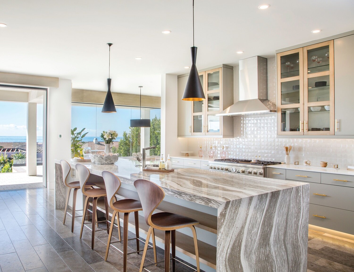
As a Fort Myers interior decorator, I’m passionate about making homes pretty, functional and comfortable. And I like to start with what my clients have and work from there. It’s always a privilege to come into someone’s space to help make it suit their lifestyle and provide a sense of calm. It’s what we are all seeking. In that regard, we are all in this together.

After being at home for the past three months, we are trying to decide what we want our homes to be as we go forward. What works? What doesn’t? How can we be more comfortable? One thing for sure, color plays a huge part in how we feel. From Benjamin…

After being at home for the past three months, we are trying to decide what we want our homes to be as we go forward. What works? What doesn’t? How can we be more comfortable? One thing for sure, color plays a huge part in how we feel. From Benjamin Moore, the facade of this home is in Flawless AF 320, Aura Exterior, satin. Shutters: Shorehouse Green 2047-50, Aura Exterior, semi-gloss. Photo: Benjamin Moore

Since we have all had plenty of time to look around our homes, if you are like me, you have made a list of what you want to change. Maybe a paint color or a piece of furniture. Something that may be fine if home is where you just eat and sleep before starting a new workday. But if we are spending more time in our space, it takes on a different tone as we try to create a calmer environment. We’ve had some time to decide what we really need and what we can do without.

Rethink color

You may be surprised at how your tastes have changed. More muted tones of bold colors. Go with what you love. No rules.

A word about clutter

For some, a life without clutter just does not work. My suggestion: make it work for you. Organize it and control it. Make it part of your eclectic environment. Your signature look. If that’s what you want.

Make things convenient

Rearrange items that you use every day so you can reach them without climbing on a ladder or crawling on the floor to reach the back of a cabinet. Shift things around until they work for you on a daily basis.

Create a gallery wall.

During our time at home, a client asked me what she should do with a stack of favorite photos that she had ripped out of magazines. I told her to hang them on a wall in her office from ceiling to floor. I mean, why not? It looks great, adds visual interest and she loves the photos.

Display photos of people you love

For a couple of years, there was this thing about not having too many personal photos around the house. Now that we are missing family and friends, they have made a reappearance. My suggestion is to put them all together. On a table, a piano or a bookcase. People love to look at them and usually will move their photo to the front row when no one is looking!

Rearrange the furniture

Okay, maybe you are limited here but try it. You can always move it back. Split the two chairs apart. Move the sofa. Try a different view. It might work.

As you think about making some changes, take a breath and come up with a list and a plan. And consider a few things that we all hope to never see again:

Word art

Go for a pretty piece of art instead.

Bedroom “sets”

Matchy matchy. You can do better. Purchase a great bed and repurpose or purchase nightstands that don’t match. Flea markets, antique shops, online sales.

Barn doors

These, along with shiplap had their day and it is done. Unless you really can’t live without either or have a farmhouse theme. Barn doors have become an accent piece but on a practical level, are exhausting. If you have space for a big, bulky, heavy barn door, you have room to install a pocket door.

Chevron.

Did anyone ever really think chevron was pretty? Okay. It was “different.” But now it’s just plain tired. There is so much that is gorgeous. Don’t waste your money.

Terrazzo.

Every few years this makes a return appearance. But as we seem to be moving away from mid-century modern, it’s time to say goodbye to this and look at other options.

Huge entertainment centers

They take over the entire room and most are just plain unattractive. Instead, go for a streamlined TV stand and arrange some art around it.

Loveseats

They have no real place in a home. Only one person can sit in one so why not purchase a sofa and a chair or two? Don’t let a anyone talk you into one.

Formal living rooms

If you have been at home for a while, you know how useless and uncomfortable they are. Most of my clients have turned them into bar/entertainment rooms.

It will be a while before we figure out what our home means now. Meanwhile, take breaks from social media. Avoid non-stop news. Stay safe. And take a nap.


Wrenda Goodwyn is a Southwest Florida interior decorator, A.S.I.D. associate and gold member of the Interior Redecorators Network. She helps homeowners throughout Southwest Florida with timeless, affordable ways to create beautiful spaces and solves decorating problems. Her articles appear the first Saturday of each month. For more information visit her website at spectacularspaces.com. Call her at 949-1808 or e-mail .For more decorating tips, articles and photos, visit spectacularspaces.com/blog


Selecting a backsplash

Wrenda Goodwyn • special to the Fort Myers News-Press • March 5, 2020

This bright kitchen showcases Cambria's Oakmoor design on a dramatic waterfall island paired with a white backsplash.

This bright kitchen showcases Cambria's Oakmoor design on a dramatic waterfall island paired with a white backsplash. www.cambriausa.com Photo: Michael Sage

Selecting a backsplash. It’s complicated.

I’ve wanted to write about this for a long time. There’s a lot to coordinate: the countertops, the floor, paint color, cabinets. The end result is usually disastrous. And the reason is immediately clear when I walk into a home.

As a Fort Myers interior decorator, I see them every day. The homeowner tried to pull it all together and ended up with backsplash that is a mish mash of colors that they tried to match to the countertops. And it just doesn’t work. Busy, dated and just plain ugly.

The answer is simple: keep it simple.

The kitchen is the most expensive room in the home to renovate or to start from scratch in a new build. It’s important to focus on putting your money where you will get the best return on your investment. And even if you are on a budget, this means selecting finishes that will be timeless and will look fresh and new for years to come. I mean, seriously, who wants to replace a backsplash or countertops again in a couple of years?

A popular trend uses the same material on the kitchen's island, perimeter, and backsplash. Shown: Cambria’s new Clovelly design with copper and brown swirling veins. www.cambriausa.com Photo: Cambria.

A popular trend uses the same material on the kitchen's island, perimeter, and backsplash. Shown: Cambria’s new Clovelly design with copper and brown swirling veins. www.cambriausa.com Photo: Cambria.

So, back to keeping it simple.

Whether you have existing countertops that you are wrestling with as far as selecting a backsplash, OR if you are selecting all new finishes for your kitchen, these tips will keep you from a backsplash that will have you saying, “What was I thinking?”

What comes first? If selecting both new countertops and backsplash, always start with the countertops.

Continue up the wall. A big trend now with marble or quartz countertops: continue the same material up the wall as your backsplash. It creates a timeless, classic look that is always in style.

Go for a clean look. You can’t beat subway tiles. The price is right. There are lots of choices. You will never regret sticking with a solid color. I recommend this option for homeowners who have granite countertops that they wish to keep. You can give your kitchen a whole new look with a solid backsplash that coordinates with the granite rather than trying to come up with something that includes all o0f the colors in the granite.

Stick with a solid. We see lots of patterns in magazines and in showrooms. My recommendation is to fight the temptation and stick with a solid. A pattern will go out of style and date your kitchen.

Run the backsplash all the way up the wall to the ceiling or molding. There is nothing pretty about that little space between the tops of the cabinets and the ceiling. Continue a beautiful solid color all the way up and it becomes the focal part of the kitchen and draws the eye up. I did this in my own home with blue/green subway tiles and love the look.

Gather some samples. Place your solid color samples at the back of your counter behind the stove. Line them up together to determine which works best with your countertops. You will need to consider undertones, paint color, cabinet color, etc.

This bold, asymmetric island and backsplash in Cambria's design Golden Dragon showcases sparkling golden currents that flow through the midnight black surface. www.cambriausa.com Photo: Cambria

This bold, asymmetric island and backsplash in Cambria's design Golden Dragon showcases sparkling golden currents that flow through the midnight black surface. www.cambriausa.com Photo: Cambria

You can’t go wrong with white. Rather than trying to “match” a color, white is my go-to backsplash. And don’t think it has to be boring. Scalloped, herringbone, arabesque and subway are just a few and there are many with sparkle and bling.

Go big. This is important. Select the largest version of your favorite tile. Remember: this is going in the kitchen and you want to make cleaning as easy as possible. The tiny, patterned tiles can make cleaning the grout a lot more work than you need.

Remember this. You can still have great taste on a small budget. If you are having trouble visualizing what might work for your next backsplash, it may be time to call a professional. We can help you make a decision that works for your kitchen and will be timeless.

More tips. Too many to mention here. To see more photos and tips for selecting a backsplash, visit my blog at www.spectacularspaces.com/blog

Wrenda Goodwyn is a Southwest Florida interior decorator, A.S.I.D. associate and gold member of the Interior Redecorators Network. She helps homeowners throughout Southwest Florida with timeless, affordable ways to create beautiful spaces and solves decorating problems. Her articles appear the first Saturday of each month. For more information visit her website at spectacularspaces.com. Call her at 949-1808 or e-mail wrenda@spectacularspaces.com. For more decorating tips, articles and photos, visit spectacularspaces.com/blog

Home Inspirations: Model behavior

Wrenda Goodwyn • special to the Fort Myers News-Press• February 7, 2015

It's happened to all of us. We walk into a model home and want to say "I'll take it."

Everything is so perfect and coordinated. The lighting, paint color, furniture, artwork, window treatments. It sparkles and says, "come in and stay a while."

As a Fort Myers interior decorator, I can't tell you how many times I receive a phone call that goes something like this: "I want my home to look like a model."

If only.

Here is a dirty little secret: It's not possible. It's like looking at  a photo in a fashion magazine and saying, "I want to look like that model."

Pottery Barn's organic Ikat medallion print with bright colors and a washed effect. Photo: Pottery Barn.

It won't happen. That model doesn't even look like that model.

And it's much the same with a model home. It's designed to be a model home. Not a home that anyone lives in. Therefore, you will never be able to achieve the exact look for your space.

But here is the good news: You can manage, with some help, to achieve the feeling that the model home gives you. Whether you are looking at home magazines in which the rooms are staged for photos or at a model home designed to "sell" the home, there are some tricks that will help you capture the feeling. But on a realistic, practical level.

Fabric headboard, styled nightstand, sconces and this beautiful, organic Ikat medallion print with bright colors and a washed effect create a model feeling in a bedroom. It's like I tell all of my decorating clients, show me the feeling that you want and I will help you get there. But remember, because a model home is not designed for anyone to live in it, we need to proceed cautiously!   

Here are my favorite tips for designing your space to capture the feel of a model home for real life living:

New lighting, fresh paint and a hand-painted framed mirror transform a bathroom. Photo: Pottery Barn.

•    Clean until everything sparkles. This is the trait of a model home: not a speck of dust anywhere! And polish the furniture and wipe down all appliances.

•    Declutter and organize. I know, you don't want to but you must. Clear the countertops and organize closets/drawers. You cannot have a model home feel with a lot of clutter. It just won't happen.

•    A fresh coat of paint changes everything.  Select a neutral color palette and give your walls a fresh coat. Add color with fabric, accessories and texture. One of my current favorites: grey walls with white, blue, green accents.

•    Notice how well lit and crisp model homes always look. One reason: lighting. Check out your ambient lighting, task and accent lighting. A carefully designed plan should include all three. And for those dark, tough to light areas: sconces and floor lamps.

•    Establish a focal point in the living areas. This can be a piece of art, a beautiful view of the outdoors, an antique or eclectic piece, a fireplace.

•    Drag the furniture away from the walls. You never see this in a model home! Establish a comfortable, easy flow conversation area and make sure your furniture is in scale with the room. Note: the furniture from your previous house may not work with scale of your new/current home.

•    Eliminate pieces that no longer work for you. If you have been hauling around furniture from home to home, it may be time to start over. If you want the feeling of a model home.

•    Include a large area rug to tie things together. It makes the room look more spacious.

•    Style your dining room table: set it for your next meal (like a model) or create a tablescape in the center that becomes permanent and you can enjoy it every day. Rather than a dining room table that just sets there unused. And unpretty!

•    Style your coffee table. I like to divide my tables into sections: books, flowers and a pretty tray with something that you love.

•    Refresh the bathroom: Hang a chandelier. Frame the mirror or replace with two single hanging mirrors. Add new sconces over the mirror.

•    Less is more. Always. Go for somewhat of a minimalist look but not to an extreme. It's one of the reasons that we love models homes: they are not filled with our everyday "stuff."

•    This is an easy one and it has to do with artwork. Go for large pieces over the sofa and think in terms of three's. Cut a large image into three sections or try it with a piece of fabric cur three times and stretched over canvas.

•    Add some drama to the bedroom. Paint an accent or add a wall covering to the wall behind the bed. Invest in a fabric headboard. Add sconces for lighting. Purchase new bed linens in a fresh, bold color. Declutter the nightstand.

Wrenda Goodwyn is a Southwest Florida interior decorator. Home Inspirations appears the first Saturday of each month. Visit her website at spectacularspaces.com. Call her at 949-1808 or e-mail wrenda@spectacularspaces.com. For more decorating tips and photos, visit spectacularspaces.com/blog