
Simply white: How to get it right in your home
/Wrenda Goodwyn • special to the Fort Myers News-Press • November 14, 2015
When Benjamin Moore recently announced its 2016 Color of the Year – Simply White OC-117, there was a lot of surprise among designers and homeowners. Many wondered why Benjamin Moore had selected a color that was lacking in color. Others love it for its versatile, crisp, cleanliness.
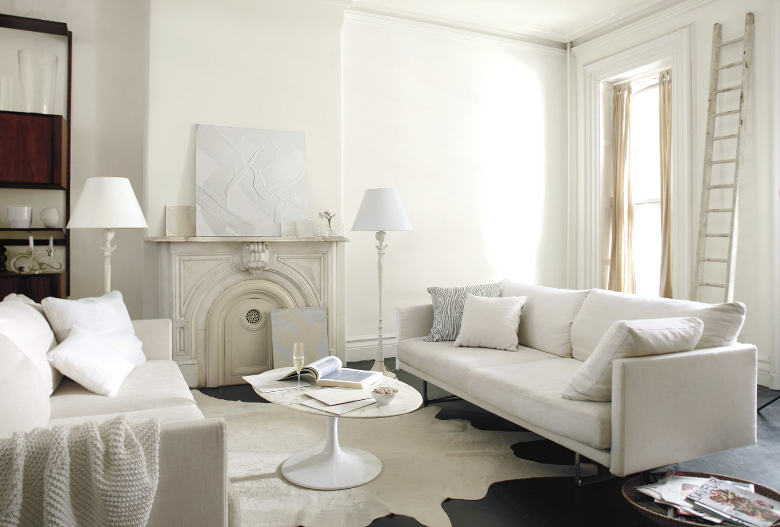
All white family room walls are done in Simply White )C-117, matte finish. Trim is Simply White semi gloss. Photo: Benjamin Moore.
At the same time, the company also unveiled Color Trends 2016, a corresponding palette of 23 colors to illustrate how white works within the color spectrum. The selections include a variety of yummy hues like Lemonade, Patriot Blue, French Press, Creme Puff, Ravishing Redand Gentle Violet. And this is where white really shines.
Where do these trends come from?
The Benjamin Moore Color Studio forecasts color trends after a year of research attending major industry shows around the world, while also taking cues from standouts in architecture, fashion, textiles, home furnishings and the arts. White transcends style, and is seen in traditional, transitional and modern interiors.
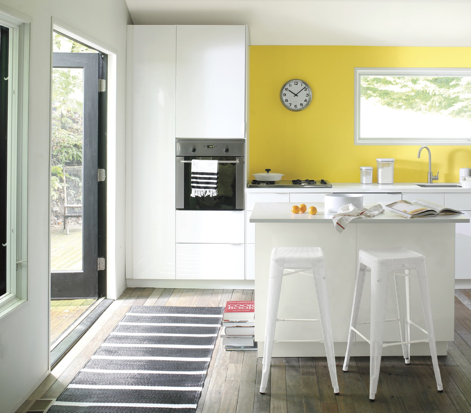
White with a pop of cheerful yellow. Accent wall in Banana Yellow 2022-40, eggshell finish. Wall and ceiling in Paper White OC-55, eggshell finish. Ceiling in Waterborne Ceiling Paint, ultra-flat finish. Photo: Benjamin Moore.
As a Fort Myers interior decorator who spends every waking moment thinking about color and creating color palettes for my clients, I can tell you two things about white:
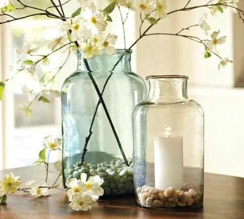
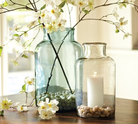
· It's not boring. That would be beige but not white. It's like an artist's canvas. Start with white and you can go anywhere without a commitment that will come back to haunt you. And there is no color that doesn't work with white. The right white.

Create a beautiful color palette for your home using white and Benjamin Moore's Color Trends for 2016. Photo: Benjamin Moore.
· Depending upon the room, the light, the furnishings, the artwork, white can be bit tricky to pull off. Done well, it's spectacular. Done poorly, it leaves a lot to be desired. I like to start with white as a backdrop and build the room from there with lots of texture, accents and accessories.
My favorite white rooms
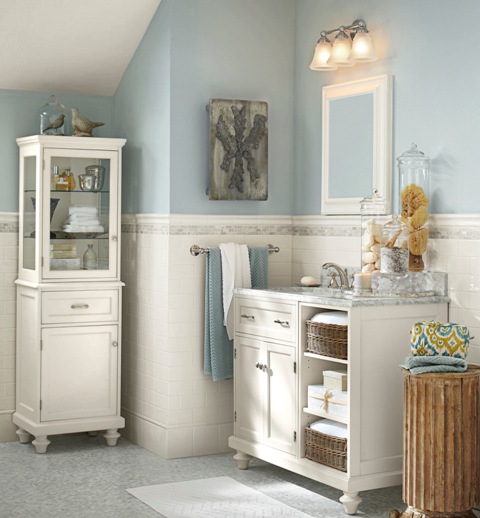
· Master bathrooms. No color gives a master bath a cleaner, more spa-like feel that white. Combine it with white tile, towels, rugs, accessories and beautiful white sconces and you have a total makeover.
· Kitchens. Dark flooring, white cabinets and countertops, stainless pendant lighting, white or stainless appliances. Perhaps a yellow or blue accent wall. Beautiful.
Try either of these options and you will have friends asking for the name of your interior decorator.

Add drama to a white room with a wall done in Mascarpone AF-20, eggshell finish. Entry is in Royal Flush 2076-20 in eggshell finish. Trim (semi gloss) and door (satin finish) in Ballet White OC-9. Photo: Benjamin Moore.
If you are thinking about a white room in your home
· White can be very dramatic by itself or with accent walls or just the right furnishings.
· White gives you a chance to start with a clean palette. To experiment with other colors, accent walls. All without the commitment of an expensive wallpaper.
· Yes, white is a color. There are 200 whites at Benjamin Moore. Five of the top ten selling paints in their collection are whites.
· Beware of undertones. Yes, those pesky shades of green, pink, blue, gray...depending upon the color and the lighting. Get around making a mistake by painting a portion of a wall as a test and check it out as the light changes during the day. This is something that I tell my clients to do with any color but with white it's especially important.
· White is forgiving. It can make flaws in your walls fade away where a bright color calls attention to every detail.
· If white frightens you, start with white sofas, chairs. Then see if you want to go further. White can be in your accessories and furnishings. It does not have to be on your walls.
· A white room requires lots of textures and accessories. My favorite: white walls, dark flooring, area rugs, white comfy sofas, lots of colorful pillows, green plants, colorful art on walls, white shutters. This is a room that if pulled together correctly, screams "come in and make yourself at home."
And that's what it's all about.
Wrenda Goodwyn is a Southwest Florida interior decorator. Her column, Home Inspirations appears the first Saturday of each month. Visit her website at spectacularspaces.com. Call her at 949-1808 or e-mail wrenda@spectacularspaces.com. For more decorating tips and photos, visit spectacularspaces.com/blog