

Home Inspirations: Chipping away at paint color
/It's the first Saturday in March and daylight savings time is kicking in tonight. Spring is right around the corner. This means that most of us are thinking about a little interior change to mark a new season. And one of the best (and easiest) ways to enhance your space is with color. Check out my article this morning with tips on how to avoid color confusion. And happy spring!
Wrenda Goodwyn • special to the Fort Myers News-Press• March 8, 2014

Make a statement in an entry with a bold accent wall in Sherwin-Williams “Naval” for Pottery Barn.
Make a statement in an entry with a bold accent wall in Sherwin-Williams “Naval” for Pottery Barn. Photo: potterybarn.comThere you are standing in a paint store surrounded by thousands of paint chips...all colors, shades, textures and palettes. Even if you decide to paint the entire house white, there hundreds of choices of white. What's a home decorator to do?
Selecting paint colors is overwhelming for most homeowners. Books have been written about this subject and it is impossible to condense it all into one article. As a Fort Myers interior decorator, it is my most requested service. The phone call often goes like this: "I have no idea what colors to paint. Can you just come over and chose for me?"

Photo: Benjamin Moore
This is not a joke. And neither is selecting paint for your walls. It is the most important part of your decorating. It makes the most dramatic change in your space and most important: if you can only implement one change in your design plan, select color. It is the most value for your money.
The wall is not your enemy! Done well, paint color choices will change the space. And it will make you love it when you walk into the room. And loving your home is the goal.
We know a lot about what color means. For example: Blue gives us a sense of peace. Green can be a healing color. Yellow and orange are happy colors. Red is energizing (Trouble sleeping? Don't use it in a bedroom!). And the list goes on and on.
Andyou have to consider lighting throughout the day, undertones and lots of other factors. And you cannot possibly pick a paint color from a one inch swatch. And you absolutely have to test the paint before committing to an entire wall.
To give you a few tricks of the design trade that may help in your paint color selection, consider these tips. And don't forget, if you just cannot make a decision, call a professional who is trained in color planning. We thrive on these challenges and do this every day.
• Rule number 1: It's all about you! Coco Chanel said that "The best color in the whole world, is the one that looks good on you." Why would you paint a room that does not flatter you?
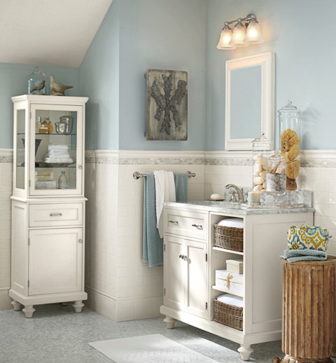
For a bath select colors that are tranquil and reminiscent of the sea. This Pottery Barn-inspired bath with Sherwin-Williams “Krypton” with a calm, clean white.
• It's fun to break decorating rules but this is one I never stray from: When selecting new colors, follow nature as your guide. Mother Nature has perfected the color palette so imitate her. This is a rule I always follow.
• Stick with two or three (at the most) paint colors for your home. The result: Beautiful and restful. You can add more color with accessories. Don't try to put all of your color on the walls.

• Connect your rooms. Don't make each room a completely different color. You want to have a plan so the house makes sense. An idea my clients seem to like: paint all of the main rooms (living room, entry, kitchen) a neutral shade. Use color in the bathrooms, bedrooms and den. I also like to paint the master bedroom and bath in coordinated shades to give it a hotel/master suite feeling.
• One trend to consider: No more white ceilings! Check out the decorating magazines. We are now using color on the ceilings or a cream shade. No more super white.
• Neutrals: You can't go wrong with these. Pure and simple. If your natural light is great, neutrals in the main rooms are so easy to live with and make it easy to add color in accessories, wall treatments and more.
• Finishes: often a trouble spot for homeowners. The rule: Pick paints with a bit of shine, such as satin and eggshell, in high-traffic areas, kitchens and bathrooms. Use semi gloss and glossy paints and enamels to emphasize moldings, wainscots and banisters. Flat finishes are best for ceilings and imperfect surfaces because they hide flaws. Glossy sheens emphasize problem areas.
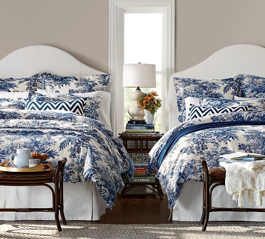
Pottery Barn’s twilight blue Matine tolie bedding is a perfect accent color for Sherwin-Williams “Functional Gray” walls. Photo: potterybarn.com
• You get what you pay for. It's true. I give my clients the same advice as when they are purchasing a sofa: buy the best paint you can afford. It does matter. It looks prettier, has more pigment and will last longer. Premium paint also spreads easier, needs fewer coats and will hold up against repeated cleaning.
• A word about gray. This is definitely the new beige. And it is gorgeous with some version of it working in almost every home from a beach cottage to an estate home. It also works with almost any color palette or pop of color. It can be classic, sexy, shimmery, sexy, calming.
• Make an entrance. Don't forget the front door. And you can be very brave here. Go with something strong and bold that makes a statement. It is the easiest color change of all.
Need help visualizing color for your rooms?
Pottery Barn and West Elm have partnered with Sherwin Williams to create seasonal palettes to coordinate with their furnishings. Details: sherwin-williams.com/architects-specifiers-designers/color/find-and-explore-colors/color-collections/west-elm-collection/.
In addition, Ballard Designs has teamed up with Benjamin Moore to offer advice on paint colors to compliment their designs at howtodecorate.com/category/decorating/paint-colors/.
Wrenda Goodwyn is a Southwest Florida interior decorator. Home Inspirations appears the first Saturday of each month. Visit her website at spectacularspaces.com. Call her at 949-1808 or email wrenda@spectacularspaces.com. For more decorating tips and photos, visit spectacularspaces.com/blog