

Color of the year is historic and timeless: a fresh take on green
/Wrenda Goodwyn • special to the Fort Myers News-Press & Naples Daily News/USA Today Network
If you've been paying attention to decorating trends lately, you've probably noticed that green is everywhere.
On walls. On kitchen cabinets. On furniture. Even on ceilings. And Benjamin Moore has announced its Color of the Year for 2027: Webster Green HC-130.
And I have to say, I love it.
As a Southwest Florida interior decorator who helps clients select colors for their homes, I see a lot of paint colors. Some come and go. Others have staying power. I think this one is a keeper.
Benjamin Moore describes Webster Green as a sophisticated, timeless shade.
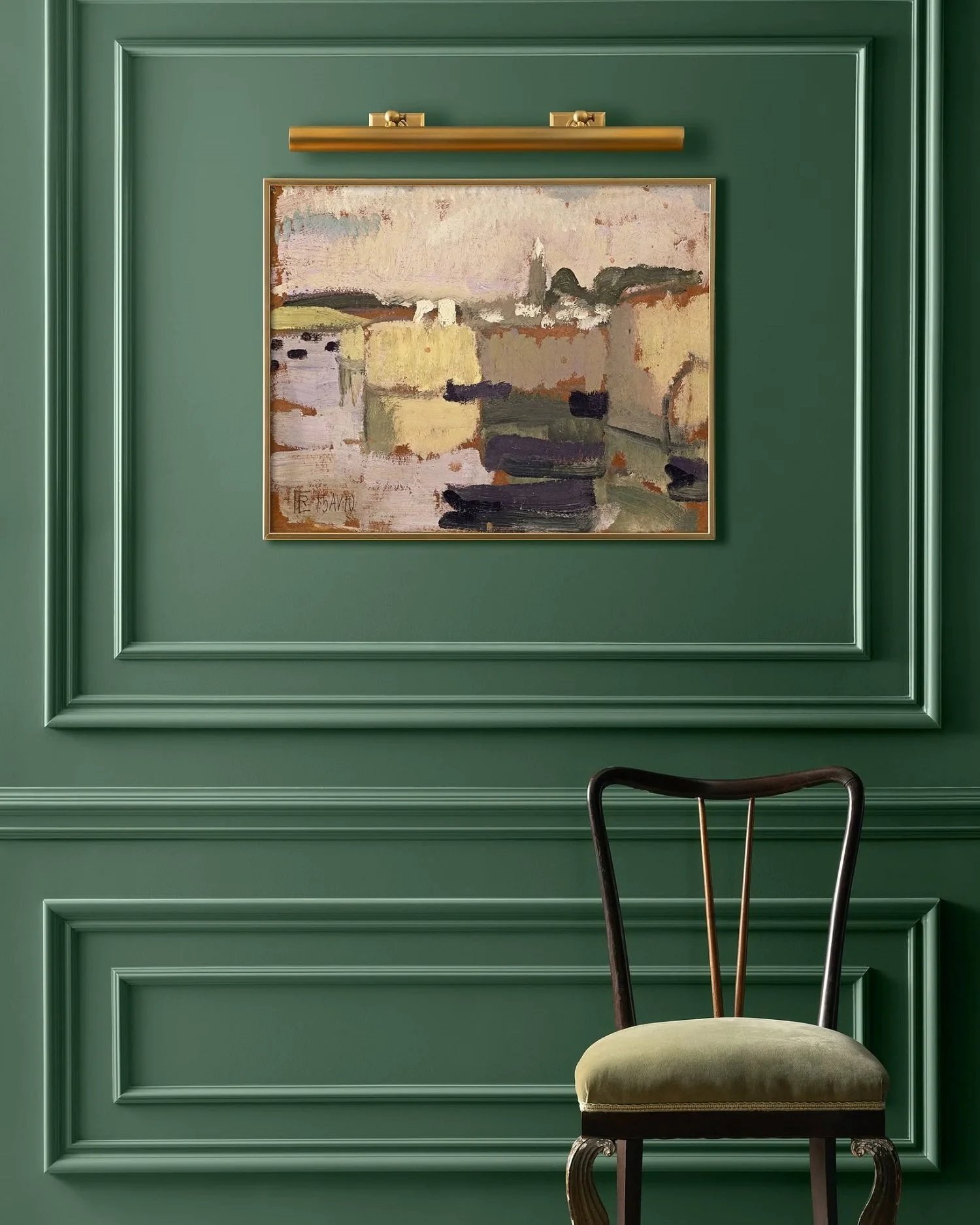
Rich green walls with architectural details create a dramatic backdrop for artwork. Photos: Benjamin Moore
What does that really mean for your home?
It's a beautiful mid-tone green with subtle blue-gray and yellow undertones. It's from the Historic Collection, so it's not actually a new color. Just one that's getting some well-deserved attention.
And that's part of its appeal.
It feels fresh without being trendy. Rich without being overwhelming. And it works beautifully with traditional, coastal, transitional and contemporary interiors.
When paint companies announce their colors of the year, I look at them as pure fun. Inspiration. A chance to consider a color you might not have thought about using.
It doesn't mean you should run out and paint your entire house green. But it might encourage you to try something a little different.
And you don't necessarily need a paintbrush.
Where to use Webster Green
Kitchen cabinets. If you're thinking about updating your kitchen, green cabinets can be a beautiful alternative to white, gray or navy. Pair them with warm wood, light countertops and brass hardware for a classic look.
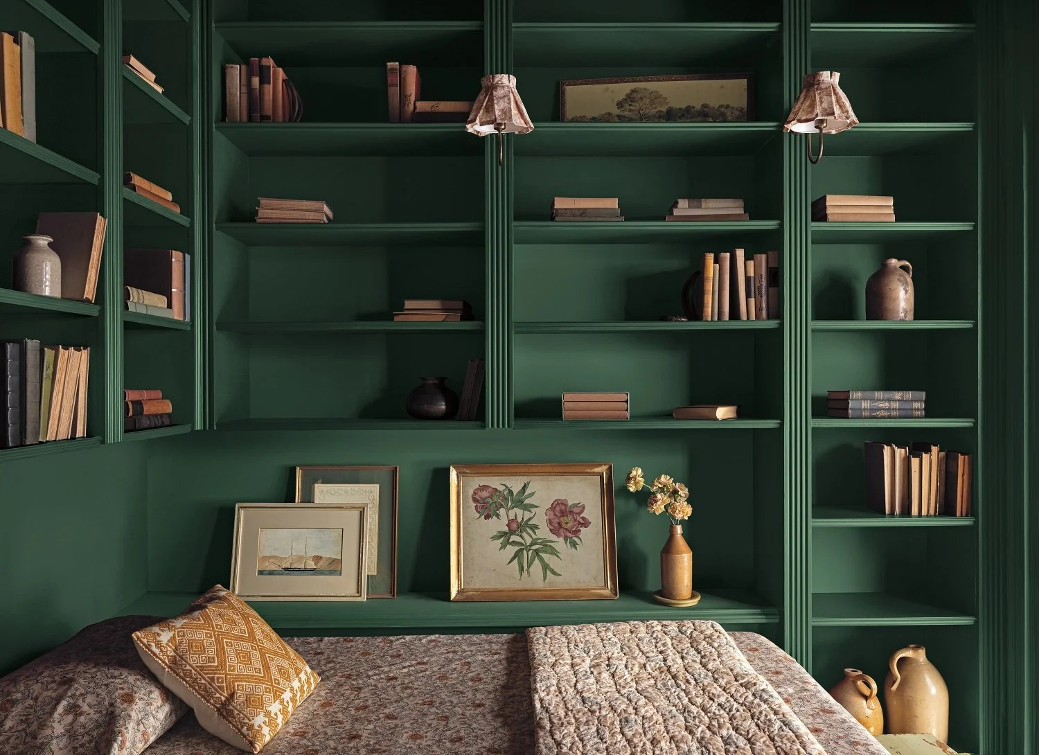
Painting bookcases and built-ins the same color creates a cozy, collected look. Books, artwork and treasured accessories complete the space in this study. Photo: Benjamin Moore
Bathroom vanities. A green vanity can give a bathroom some personality without committing to an entire room of color.
Bookcases and built-ins. This may be one of my favorite ways to use this color. Painting built-ins the same color as the surrounding walls creates a beautiful, collected look. Add books, artwork and a few treasured accessories. Instant character.
Front doors. A green front door can be a welcoming change from black or traditional wood tones.
Trim and architectural details. Green can beautifully highlight moldings, doors and other architectural features.
Ceilings. Yes, ceilings! We tend to forget about that fifth wall. A little unexpected color overhead can make a room feel special, especially when paired with neutral walls.
Powder rooms. These small spaces are perfect for taking a decorating chance. Try green on the walls and ceiling for a cozy, dramatic look. Or combine it with a beautiful patterned wallcovering.
Bedrooms and living rooms. If you're ready to make more of a commitment, Webster Green can create a warm, comfortable space that feels both elegant and inviting. And if an entire room seems like too much, try an accent wall behind a bed or as a backdrop for artwork.
Not ready to paint? No problem
There are plenty of ways to bring green into your home without opening a can of paint.
In fact, I did just that.
I had a sofa reupholstered in a similar green shade. You can accomplish the same thing with a couple of pillows, a throw, an upholstered chair or accessories.
Sometimes just a little color is all a room needs.
And if you're not quite sure whether green is for you, start small. Live with it for a while. See how it works with your furniture, fabrics and artwork.
Wait. There’s more color
Benjamin Moore didn't stop with Webster Green. Its Color Trends 2027 palette includes seven other shades that work with it or stand beautifully on their own.
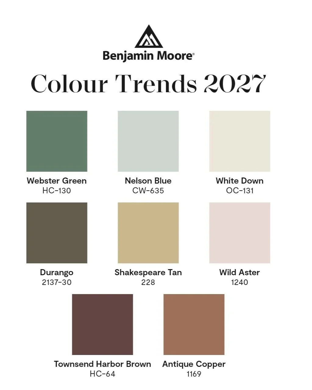
White Down, a soft, cozy off-white; Nelson Blue, a watery pale blue; and Shakespeare Tan, a warm golden neutral.
For a little more color, there's Wild Aster, a soft pink with gray undertones, and Antique Copper, a warm, earthy brown.
And for those who love deeper, moodier colors, there's Durango, an olive-toned neutral, and Townsend Harbor Brown, a rich burgundy-brown.
Together, they create a palette that feels warm, comfortable and timeless. And that's what I like about it.
The colors work beautifully with natural woods, antiques, traditional furnishings and the lighter, more relaxed pieces we love here in Southwest Florida.
And remember, the best color is still the one you love. The one that works with your furnishings, your lighting and the way you live.
But if you've been thinking about adding a little green to your life, this might be just the inspiration you need.
Wrenda Goodwyn is a Southwest Florida interior decorator, writer, stylist and color expert. For more than two decades, she has helped homeowners create beautiful, comfortable homes that reflect the way they live. Whether refreshing one room, choosing the perfect paint colors or planning a complete makeover, she specializes in solving decorating challenges and creating timeless interiors without spending a fortune. Her decorating column appears the first Saturday of each month. Call 239-850-5800 or email wrenda@spectacularspaces.com. For more decorating inspiration, visit spectacularspaces.com and spectacularspaces.com/blog.