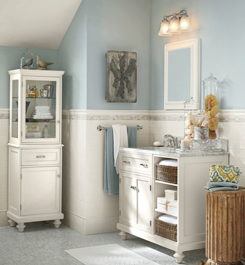
Quick Decorating Tips for a Happy Home (some are free!)

Wrenda Goodwyn • special to the Fort Myers News-Press •June 4, 2016

Try something new with color with this perky blue and green setting with a large-scale graphic pattern (Midland) that has a leaf-like motif and gives a nod to old Federal style wallpaper. The wallcovering shown here is Troy, a small-scale texture with characteristics of a basket-weave. Photo credit: Courtesy of Thibaut.www.thibautdesign.com 

There are a few things that really drive decorators and designers crazy. But the good news: the minute we walk into your house, we can spot them and help you correct them quickly. Today, I am sharing my short list with you and guess what? Many of these can be corrected before you finish reading this article and you don’t even have to get in your car to drive up and down 41 looking for more “stuff” to bring into your house! 

So, if you’re happy with your home sweet home but it doesn’t seem quite right, read on and maybe the one little tweak that you need is listed below. 

Be realistic about a budget.

I've never been into a client’s home that I couldn’t improve.  As a Southwest Florida interior decorator, I have seen it all. Realistic budget. No budget. Tiny budget. I base my decorating on affordable solutions for home décor and I’ve had lots of practice of making a home look great without wrecking your finances. 

It’s important to keep in mind that reality home shows are not a home interior professional’s friend. They give the impression that a designing couple can breeze through your home, redo it from the inside to the outside, all for a song. Quick, beautiful, cheap, fast. It’s just not so and what they do not include are the behind the scene costs and a realistic, honest budget. 

Pretty painted chest set against the backdrop of Thibaut’s Portofino wall covering. These large, stylized, flowers and other fun details make this a striking accent wall. The wallpaper is rotary screen printed, which uses a lot of ink to make the flowers slightly textured. Photo credit: Courtesy of Thibaut.  www.thibautdesign.com

So having said that, whatever your budget, be realistic and honest with yourself. A lot of my tips below are free or require little $$. Others may be something to work toward (phase two, as I say!). The more realistic you are, the happier you will be with your home. 

No plan? Then it doesn’t matter where you are going.

Now that you have a budget nailed down, take some time to get your thoughts organized and develop a plan. This is key to a happy outcome. What are the priorities? What can you do without spending a lot? Do you need a total redo or will a good design plan help to sort out where to begin? Do you need the professional help of a designer or can you do it yourself with a plan? No plan? The result will be a house filled with rooms that all have a different look. 

Please: Say goodbye to these. Now.

Refrigerator magnets. Fake flowers. A lot of junk on top of kitchen cabinets. Enough said about this. 

Pull furniture away from the walls.

Get rid of the uncomfortable conversation area and create some space. A U-shaped arrangement is best.  Sofa and two chairs or two sofas.  We realize the sized of the space dictates placement. Give it a fresh look. 

Declutter. Declutter. Declutter.

I know, I talk about this all the time. But you have to do it over and over. Things have a way of accumulating when you aren’t looking. And without this key element, you may as well not try to make a change. You will just be rearranging the clutter. 

Create a palette: don’t just throw color around.

If you get the color palette right, everything else falls into place. This is my most popular service and the one that homeowners have the most difficulty establishing. And here’s why: it’s not all about putting paint on the wall. It is about creating a color scheme for the entire home and carrying the color throughout in fabric, accessories, window treatments, pillows, etc. This is definitely the tricky part of decorating. The fun part and the most important after your budget and your plan.  So spend some time on this one.   

Decorating: it’s all about you.

It’s not about your neighbors, your relatives who come to visit each year, your bridge club or a friend who has a daughter who is a decorator in another state. We hear these sources of input all the time! Filter out the noise and keep in mind this is your home and your opinion is the only one that counts. 

Curate your own art gallery.

Take a fresh look at your art work. I like to select a space on a wall and make it look like a museum gallery. Place everything on the floor. With painter’s tape, mark off the area you wish to cover on the wall. The best height for your key pieces: eye level. This is usually 57-58 inches from the floor. Once you have the arrangement, you are ready to create your gallery. 

Paint your entry door on both sides.

If you don’t have the time or budget for anything else, give your home a lift and do this one. And here is a tip: paint both sides of the door for a professional design look. My advice: if you love a color but are afraid that it just will not work in your home, use it on the door. 

Don’t fear wall coverings!

For a long time, we focused on paint and textures for walls. It seems that wallpaper (as it was called) went by the wayside. But it’s back and it’s fabulous. Textures, sheens, feathers. Take a fresh look and at least try it for a powder room or an accent wall. 

Don’t love it? Paint it or pass it on.

Have an antique that you no longer love? Like an armoire or chest? Paint it! What good is it if you no longer want it in your home? Our tastes all change and color can change everything. Otherwise, pass it on and let someone else love it. 

Think about white.

It looks beautiful in magazines. White walls. White sofas and chairs. Gorgeous and carefully styled. Do you have the lifestyle for all white? Will you be able to accent with beautiful artwork and accessories to carry it off? If the answer is yes, go for it! If not, rethink this commitment. 

Come into the light!

We can never have enough and right now your home is likely lacking in this area. Because all of us seem to overlook this important element in our homes.  Check all four corners of your rooms for proper lighting. Remember: we need overhead, task and ambient lighting. Make sure you use dimmers and if this is not possible, plugin adapters work fine.  Chandeliers, floor lamps, mirrors and glass doors also reflect light. 

Decorative painting. Ugh.

This was a trend that has (thankfully) passed on. I am not speaking of the beautiful treatments for recessed ceilings. Rather the unfortunate fad of things like sponge painting, globing things like wadded up paper on the wall, stenciling and other horrors. When it comes to wall treatments: a good quality paint in a beautiful color and finish or the most outrageous wall covering you can afford on an accent wall. 

Say goodbye to your unicorn collection.

We all have collections that made sense at one time. But time is the problem. It may be time to say goodbye. If it’s not a priceless collection or one that you absolutely love, it may have outlived its value. So when you are doing your decluttering, you may want to say goodbye and let someone else love it. 


Wrenda Goodwyn is a Southwest Florida interior decorator, A.S.I.D. associate and certified gold member of the Interior Redecorators Network. Her @home article appears the first Saturday of each month. Visit her website at spectacularspaces.com. Call her at 949-1808 or e-mail wrenda@spectacularspaces.com. For more decorating tips and photos, visit spectacularspaces.com/blog


Color your home with happiness

Wrenda Goodwyn • special to the Fort Myers News-Press• June 6, 2015

Color is the first thing we notice about a home. Does your color make you happy every time you walk in the door? Photo: Benjamin Moore.

Color is pretty much my life.

I live with a fan deck in my hand and I constantly pull it out wherever I go to match colors, to plan a color palette or just because I see a color or a fabric that I want for a client.

As a Fort Myers interior decorator, I do more color consultations than any other design service.  And there is one big reason for that: Color is the most difficult challenge for most homeowners. Get it right and the results are pure joy. Get it wrong and you will always feel like something is off in your home. And it is. Really off. If the color is not right, nothing else matters. Trust me on this.

Color is the first thing we notice about a home. Does your color make you happy every time you walk in the door?

Having the right color palette in your home is the difference between a happy home and one that says "hope you can live with me."

So many colors! How do you select the right ones? Photo: Benjamin Moore.

And it's not easy. It can be daunting. Color just plain stumps most people. So, if you are one of those people, and most of you are, I have a few tips to consider when selecting color.  Follow these tips and you will be ready to take the plunge. Or not. You may also be ready to call in a professional who can help you sort it all out and remove the stress.  After all, color creates a happy home and process should be fun.

Here we go with my favorite "don'ts."

  • Don’t ask a painter or a paint store to help you select color. They sell paint. Not color. They are not decorators or designers. They are painters who put paint on the wall  or paint sellers. Simply put, they know how to paint a house and can tell you the best kind of paint to use but they just don't know how to select color.
  • Don’t select a color from one of those itsy bitsy fan deck samples or tiny swatches. You must (and this is non-negotiable) test the color by painting a large area or a foam core board.
  • Don't just throw the paint on the wall and make a decision. I insist  that my clients "live" with the test color for a few days. Light changes throughout the day and is different in each room and that must be taken into consideration.

Now for some do's.

 Color palette from the Benjamin Moore Williamsburg Collection.

 Color palette from the Benjamin Moore Williamsburg Collection.

  • Make a plan for the room (or house) before you look at color. You have to start somewhere when designing an empty room and that should not be with the paint color. Select furnishings,  fabric, counter tops and other finishesand even a few accessories and THEN look at color. I have clients who call and ask me to have an entire new home painted by next week before they select furniture. You may love that pretty coral paint but what happens when you fall in love with a sofa that doesn't relate to the color? Answer: you have to repaint. We want to avoid that costly mistake!  If you want coral, accessories may be the best way to go.
  • Forget this rule. It's just not true. I don't know who started it but painting small spaces a dark color does NOT make the room look smaller. My favorite: powder rooms done in dark hues.
  • It's fun to break decorating rules but this is one I never stray from: when selecting a color palette,  follow nature as your guide. Mother Nature has perfected the color palette soimitate her. This is a rule I always follow. If it's not a color found in nature, forget it.
  • Stick with two or three (at the most colors for your home. The result: Beautiful and restful. You can add more color with accessories.  Don't try to put all of your color on the walls. Tip: the right pillows will change any room!
  • Connect your rooms.  Don't make each room a completely different color. You want to have a plan so the house makes sense. An idea my clients seem to like: paint all of the main rooms (living room, entry, kitchen) a neutral shade. Use color in the bathrooms, bedrooms and den. I also like to paint the master bedroom and bath in coordinated shades to give it a hotel/master suite feeling.
  • One current trend that I love and encourage my clients to try: No more white ceilings! Check out the decorating magazines.  We are now using color on the ceilings or a cream shade. No more super white.
  • My latest color crush: Boca Raton Blue by Benjamin Moore. I can't think of a room that shouldn't have a little of this color. At least paint a front door (on both sides) or an entry ceiling.
  • Consider undertones. All color is not created equal. Look at the number of whites that you can select from on a fan deck. The reason a color works or does not work: undertones.
  • When in doubt, go neutral. This never fails. Neutral walls with stronger hues in fabric and accessories.  And if you really have doubts and don't know where to start, call a professional. They will help you nail it.

Wrenda Goodwyn is a Southwest Florida interior decorator. Home Inspirations appears the first Saturday of each month. Visit her website at spectacularspaces.com. Call her at 949-1808 or e-mail wrenda@spectacularspaces.com. For more decorating tips and photos, visit spectacularspaces.com/blog. And to see a selection of her favorite color palettes, go to www.pinterest.com/wrendagoodwyn

Home Inspirations: Chipping away at paint color

It's the first Saturday in March and daylight savings time is kicking in tonight. Spring is right around the corner. This means that most of us are thinking about a little interior change to mark a new season. And one of the best (and easiest) ways to enhance your space is with color. Check out my article this morning with tips on how to avoid color confusion. And happy spring! 

Wrenda Goodwyn • special to the Fort Myers News-Press• March 8, 2014

Make a statement in an entry with a bold accent wall in Sherwin-Williams “Naval” for Pottery Barn. 

Make a statement in an entry with a bold accent wall in Sherwin-Williams “Naval” for Pottery Barn. 

Make a statement in an entry with a bold accent wall in Sherwin-Williams “Naval” for Pottery Barn. Photo: potterybarn.comThere you are standing in a paint store surrounded by thousands of paint chips...all colors, shades, textures and palettes. Even if you decide to paint the entire house white, there hundreds of choices of white. What's a home decorator to do?

Selecting paint colors is overwhelming for most homeowners. Books have been written about this subject and it is impossible to condense it all into one article. As a Fort Myers interior decorator, it is my most requested service. The phone call often goes like this: "I have no idea what colors to paint. Can you just come over and chose for me?"

Photo: Benjamin Moore

Photo: Benjamin Moore

This is not a joke. And neither is selecting paint for your walls. It is the most important part of your decorating.  It makes the most dramatic change in your space and most important: if you can only implement one change in your design plan, select color. It is the most value for your money.

The wall is not your enemy! Done well, paint color choices will change the space. And it will make you love it when you walk into the room. And loving your home is the goal.

We know a lot about what color means. For example: Blue gives us a sense of peace. Green can be a healing color. Yellow and orange are happy colors. Red is energizing (Trouble sleeping? Don't use it in a bedroom!). And the list goes on and on.

Andyou have to consider lighting throughout the day, undertones and lots of other factors. And you cannot possibly pick a paint color from a one inch swatch. And you absolutely have to test the paint before committing to an entire wall.

To give you a few tricks of the design trade that may help in your paint color selection, consider these tips. And don't forget, if you just cannot make a decision, call a professional who is trained in color planning.  We thrive on these challenges and do this every day.

• Rule number 1: It's all about you! Coco Chanel said that "The best color in the whole world, is the one that looks good on you." Why would you paint a room that does not flatter you?

For a bath select colors that are tranquil and reminiscent of the sea. This Pottery Barn-inspired bath with Sherwin-Williams “Krypton” with a calm, clean white.

For a bath select colors that are tranquil and reminiscent of the sea. This Pottery Barn-inspired bath with Sherwin-Williams “Krypton” with a calm, clean white.

• It's fun to break decorating rules but this is one I never stray from: When selecting new colors, follow nature as your guide. Mother Nature has perfected the color palette so imitate her. This is a rule I always follow.

•  Stick with two or three (at the most) paint colors for your home. The result: Beautiful and restful. You can add more color with accessories. Don't try to put all of your color on the walls.

Color Consultation.jpg

• Connect your rooms. Don't make each room a completely different color. You want to have a plan so the house makes sense. An idea my clients seem to like: paint all of the main rooms (living room, entry, kitchen) a neutral shade. Use color in the bathrooms, bedrooms and den. I also like to paint the master bedroom and bath in coordinated shades to give it a hotel/master suite feeling.

• One trend to consider: No more white ceilings! Check out the decorating magazines.  We are now using color on the ceilings or a cream shade. No more super white.

• Neutrals: You can't go wrong with these. Pure and simple. If your natural light is great, neutrals in the main rooms are so easy to live with and make it easy to add color in accessories, wall treatments and more.

• Finishes: often a trouble spot for homeowners. The rule: Pick paints with a bit of shine, such as satin and eggshell, in high-traffic areas, kitchens and bathrooms. Use semi gloss and glossy paints and enamels to emphasize moldings, wainscots and banisters. Flat finishes are best for ceilings and imperfect surfaces because they hide flaws. Glossy sheens emphasize problem areas.

Pottery Barn’s twilight blue Matine tolie bedding is a perfect accent color for Sherwin-Williams “Functional Gray” walls. Photo: potterybarn.com

Pottery Barn’s twilight blue Matine tolie bedding is a perfect accent color for Sherwin-Williams “Functional Gray” walls. Photo: potterybarn.com

• You get what you pay for. It's true.  I give my clients the same advice as when they are purchasing a sofa: buy the best paint you can afford. It does matter. It looks prettier, has more pigment and will last longer. Premium paint also spreads easier, needs fewer coats and will hold up against repeated cleaning.

• A word about gray. This is definitely the new beige. And it is gorgeous with some version of it working in almost every home from a beach cottage to an estate home. It also works with almost any color palette or pop of color. It can be classic, sexy, shimmery, sexy, calming.

• Make an entrance. Don't forget the front door. And you can be very brave here. Go with something strong and bold that makes a statement. It is the easiest color change of all.

Need help visualizing color for your rooms?

Pottery Barn and West Elm have partnered with Sherwin Williams to create seasonal palettes to coordinate with their furnishings. Details: sherwin-williams.com/architects-specifiers-designers/color/find-and-explore-colors/color-collections/west-elm-collection/.

In addition, Ballard Designs has teamed up with Benjamin Moore to offer advice on paint colors to compliment their designs at howtodecorate.com/category/decorating/paint-colors/.

Wrenda Goodwyn is a Southwest Florida interior decorator. Home Inspirations appears the first Saturday of each month. Visit her website at spectacularspaces.com. Call her at 949-1808 or email wrenda@spectacularspaces.com. For more decorating tips and photos, visit spectacularspaces.com/blog

Home Inspirations: Model behavior

Wrenda Goodwyn • special to the Fort Myers News-Press• February 7, 2015

It's happened to all of us. We walk into a model home and want to say "I'll take it."

Everything is so perfect and coordinated. The lighting, paint color, furniture, artwork, window treatments. It sparkles and says, "come in and stay a while."

As a Fort Myers interior decorator, I can't tell you how many times I receive a phone call that goes something like this: "I want my home to look like a model."

If only.

Here is a dirty little secret: It's not possible. It's like looking at  a photo in a fashion magazine and saying, "I want to look like that model."

Pottery Barn's organic Ikat medallion print with bright colors and a washed effect. Photo: Pottery Barn.

It won't happen. That model doesn't even look like that model.

And it's much the same with a model home. It's designed to be a model home. Not a home that anyone lives in. Therefore, you will never be able to achieve the exact look for your space.

But here is the good news: You can manage, with some help, to achieve the feeling that the model home gives you. Whether you are looking at home magazines in which the rooms are staged for photos or at a model home designed to "sell" the home, there are some tricks that will help you capture the feeling. But on a realistic, practical level.

Fabric headboard, styled nightstand, sconces and this beautiful, organic Ikat medallion print with bright colors and a washed effect create a model feeling in a bedroom. It's like I tell all of my decorating clients, show me the feeling that you want and I will help you get there. But remember, because a model home is not designed for anyone to live in it, we need to proceed cautiously!   

Here are my favorite tips for designing your space to capture the feel of a model home for real life living:

New lighting, fresh paint and a hand-painted framed mirror transform a bathroom. Photo: Pottery Barn.

•    Clean until everything sparkles. This is the trait of a model home: not a speck of dust anywhere! And polish the furniture and wipe down all appliances.

•    Declutter and organize. I know, you don't want to but you must. Clear the countertops and organize closets/drawers. You cannot have a model home feel with a lot of clutter. It just won't happen.

•    A fresh coat of paint changes everything.  Select a neutral color palette and give your walls a fresh coat. Add color with fabric, accessories and texture. One of my current favorites: grey walls with white, blue, green accents.

•    Notice how well lit and crisp model homes always look. One reason: lighting. Check out your ambient lighting, task and accent lighting. A carefully designed plan should include all three. And for those dark, tough to light areas: sconces and floor lamps.

•    Establish a focal point in the living areas. This can be a piece of art, a beautiful view of the outdoors, an antique or eclectic piece, a fireplace.

•    Drag the furniture away from the walls. You never see this in a model home! Establish a comfortable, easy flow conversation area and make sure your furniture is in scale with the room. Note: the furniture from your previous house may not work with scale of your new/current home.

•    Eliminate pieces that no longer work for you. If you have been hauling around furniture from home to home, it may be time to start over. If you want the feeling of a model home.

•    Include a large area rug to tie things together. It makes the room look more spacious.

•    Style your dining room table: set it for your next meal (like a model) or create a tablescape in the center that becomes permanent and you can enjoy it every day. Rather than a dining room table that just sets there unused. And unpretty!

•    Style your coffee table. I like to divide my tables into sections: books, flowers and a pretty tray with something that you love.

•    Refresh the bathroom: Hang a chandelier. Frame the mirror or replace with two single hanging mirrors. Add new sconces over the mirror.

•    Less is more. Always. Go for somewhat of a minimalist look but not to an extreme. It's one of the reasons that we love models homes: they are not filled with our everyday "stuff."

•    This is an easy one and it has to do with artwork. Go for large pieces over the sofa and think in terms of three's. Cut a large image into three sections or try it with a piece of fabric cur three times and stretched over canvas.

•    Add some drama to the bedroom. Paint an accent or add a wall covering to the wall behind the bed. Invest in a fabric headboard. Add sconces for lighting. Purchase new bed linens in a fresh, bold color. Declutter the nightstand.

Wrenda Goodwyn is a Southwest Florida interior decorator. Home Inspirations appears the first Saturday of each month. Visit her website at spectacularspaces.com. Call her at 949-1808 or e-mail wrenda@spectacularspaces.com. For more decorating tips and photos, visit spectacularspaces.com/blog

Art meets design for a walk on the wild side

Wrenda Goodwyn • special to the Fort Myers News-Press• January 24, 2015

It's whimsical and exotic with a touch of eclectic.  

The collection contains vibrant and varied species of birds, butterflies, rabbits, tropical leaves and orchids all utilized in creating dynamic patterns in this art-meets-design collection.  In Lee Jofa's  first artist collaboration with Groundworks, they have introduced vibrantly colored and stunning fabrics, wallpapers, and carpets designed by Hunt Slonem, a world-renowned artist best known for his Neo-Expressionist paintings of exotic animals and tropical plant life.

And it's exciting because it puts some fun into interior design. It almost says, "yes I am gorgeous, but I don't take myself too seriously."

The result: Spectacular

Slonem's paintings are layered with thick brushstrokes of vivid color, and are often cut into in a cross-hatched pattern, adding texture to the overall surface of the painting. This technique has been replicated in the fabric collection through intricate jacquard weaving and digital printing techniques, resulting in a look that is graphically stunning.  For the Groundworks' collection, several of his most popular themes and iconic works have been translated into decor for the home.

Fritillery, the butterfly motif based upon specimens Slonem studied as a boy. Photo: Kravet/Lee Jofa.

As a celebrated painter, sculptor and printmaker with more than 350 exhibitions at prestigious galleries and museums internationally,  Slonem has traveled all over the world but it was his childhood spent in Hawaii, and a year studying in Nicaragua, that have had the most profound impact on his life’s work. The vivid color combinations and exotic wildlife he encountered there inspire him to this day.

The motifs he explored in his early works, tropical birds, butterflies, bunnies and portraits, have been reduced to their essence and have become recurring themes in his extraordinary art. His spiritual connection to the concept of metamorphosis led him to include the butterfly as one of the recurring themes in his work.

And there are those iconic bunnies.

Fascination with the rabbit occurred when he realized was born in the year of the rabbit, according to the Chinese calendar. In his New York City studio,  the bunny wall consists of   salon-style groupings of his small bunny paintings, some hung while wet. These signature paintings are now collector's items.  And Bunny Wall is a wallpaper that mimics the effect of the framed paintings against different colored backgrounds.

Slonem's spiritual connection to his recurring themes elevates the simple paintings to something more significant. To Slonem, repetition is divinity. Just like the act of repeating a phrase creates a mantra, the object is elevated and the act of repeating these forms becomes an act of worship. The process of painting is sacred to Slonem, and as a result, his body of work represents so much more than what's painted on the canvas.

And just how do we incorporate some of this exotic whimsy into our southwest homes? My suggestions:

A seamless series of bunnies, unframed and multiplied, on solid and metallic backgrounds. The repetition represents luck, abundance and the gentle traits represented by the rabbit. Photo: Kravet/Lee Jofa.

A seamless series of bunnies, unframed and multiplied, on solid and metallic backgrounds. The repetition represents luck, abundance and the gentle traits represented by the rabbit. Photo: Kravet/Lee Jofa.

•    The beautiful fabric is an elegant touch for upholstery and draperies.  My favorite is to take a chair or sofa piece that has become dated or an antique and reupholster  to give it a totally new look.  And the fabric makes beautiful window panels.

•    Who can resist the Bunny Wall as an accent wall covering in an office or dining room and for the entire powder room?

•    Pillows for accents add a bright, eclectic  touch to a solid color, traditional sofa.

•    The bunny wall coverings, Hutch, are available in pink or yellow and would be a great touch for a nursery.

•    Want just a touch of these fabulous creations in your home?  Stretch a piece of the fabric on canvas for a wall or frame a section of one of the wallpapers.

To see the entire collection, visit the Kravet/Lee Jofa showroom at the Miromar Design Center in Estero or visit www.leejofa.com/groundworks_wallcoverings.htm.

Hunt Slonem will sign his new book, When Art Meets Design from 4-6:30 p.m., January 26 at Harmon-Meek in Naples. Details: 239-262-2699.

Wrenda Goodwyn is a Southwest Florida interior decorator. Home Inspirations appears the first Saturday of each month. Visit her website at spectacularspaces.com. Call her at 949-1808 or e-mail wrenda@spectacularspaces.com. For more decorating tips and photos, visit spectacularspaces.com/blog

Home resolutions (easy) to make you love your space (a lot)

Wrenda Goodwyn • special to the Fort Myers News-Press• January 3, 2015

Stage your coffee table and make it the focal point of the room. Photo: Pottery Barn.

The houseguests have departed. The decorations are packed up (well, most of them). Home sweet home may be looking a little sad without the twinkly lights.  And while it's nice to have all of the space back, it may be looking a little drab. Maybe time for a refreshening. Not a total redo. A few tweaks for positive changes that make you feel good about your home.

Stage a coffee table and make it the focal point of the room. Photo: Pottery Barn.

Welcome 2015! Each year, I forgo the impossible, guilt inducing resolutions that are broken before my Christmas tree is picked up by the recycling truck. Instead, I come up with a list of resolutions for the home.

As a Fort Myers interior decorator, I help my clients make major changes in their homes with new color choices. Giving old furnishings a new look with beautiful upholstery. Purchasing a new accent piece or rug. Changing accessories, artwork, lighting.  Giving an outdated bathroom a spa look. Deciding if now is the time for a room renovation.  Pick just one of these for your home interior resolution in 2015 and you will have a major change.

Design a gallery wall for your entry. Photo: Pottery Barn.

My resolutions are designed to be stress-free. Isn't that what we want for the New Year? Some you can do when you finish reading this column. Others will require a little thinking and planning. Whatever you select, happy decorating. I wish you a spectacular home in 2015!

•    Love everything in your home. If not, get rid of it. Open the space for something new. Just because you have had it forever doesn't mean it is still working for you. Donate it and let someone else love it.

•    Declutter. The New Year is the time. Be brave. A lot of our "stuff" has past emotional attachments. Let it go and love the extra space and calm that results.

•    Open the windows and breathe. Seriously, those windows do open! Let the toxins out (as well as the holiday smells)  and enjoy the fresh air. In southwest Florida where we run the air conditioning nonstop, this is important. Do it now!

•    Make your outdoor space more livable. Whether it is a tiny balcony or a spacious lanai with a pool, make it part of your living space. Furniture, lighting, artwork, a rug to pull it all together. Increases your space and gives you a reason to enjoy the outdoors this time of year.

•    Be realistic and don't believe everything you see on TV. If you have worked endlessly on your home and have everything you want but something is still not quite right, it may be time to call in a professional to help you rethink your space. The home shows are just that: shows. They make it look easy and inexpensive.  It's neither. Remember this is television and what looks great may not always be practical in real life.

•    Bring some new color into your home. Whether it's a new palette for the walls or a new color scheme for accessories, this is the most impactful change you can make. Visually and emotionally, it changes everything.  And for the money, it's the best value.

Add new color and give an old piece a new look for 2015. Photo: Kravet.

•    Exercise restraint. Before you blast out the door to start making purchases, stop and make a plan. Think about how you want your home to feel and what you can do to get there. Avoid mistakes.

•    Check out your lighting. One of the biggest mistakes I see in homes is lack of or incorrect lighting. And this is relatively easy to fix. We need task (work), ambient (overall) and accent (on a particular object or part of the room). Sometimes all you need to do is increase the light bulb strength!

•    Add a gallery wall. Pull your artwork or photos together on one wall for a museum or art gallery look. Go with a dark color as a backdrop. Short on space? An entry is a great place to do this.  

•    Stage your coffee table.  You likely have everything you need! A pretty tray,  favorite books, accessories, flowers. Gorgeous!

•    Tidy up the laundry room. Paint it a color that you love but are afraid to use in any otter room. Add a piece of art. Reorganize and declutter. You may enjoy doing the laundry!

•    Always go for timeless over trendy. Will you love it in five years? Buy it. And buy the best you can afford with major items like your sofa.

Wrenda Goodwyn is a Southwest Florida interior decorator. Home Inspirations appears the first Saturday of each month. Visit her website at spectacularspaces.com. Call her at 949-1808 or e-mail wrenda@spectacularspaces.com. For more decorating tips and photos, visit spectacularspaces.com/blog

Related posts:

Resolutions for a happy new year

Fill home sweet home with happiness