Moody blues and other trending colors for home interiors

 Wrenda Goodwyn • special to the Fort Myers News-Press/USA Today Network Nov. 11, 2023

Coming up with creative color palettes is pure joy for this Southwest Florida interior decorator. I love nothing more than to walk through a home getting to know the space and people who live there, and giving them a color plan that will provide happiness every time they walk in the door.

 Just when I think I have used every possible color combination that includes a variation on the color blue for my area clients, Benjamin Moore pulls out another option for the blues.

 It’s always fun to see what paint companies come up with for their Color of the Year. And this year is no exception with Benjamin Moore’s Blue Nova 825. It’s what the company calls an “out of this world,” mystical shade with just a slight hint of violet. Its inspiration comes from “the brilliance of a new star formed in space,” according to the company.

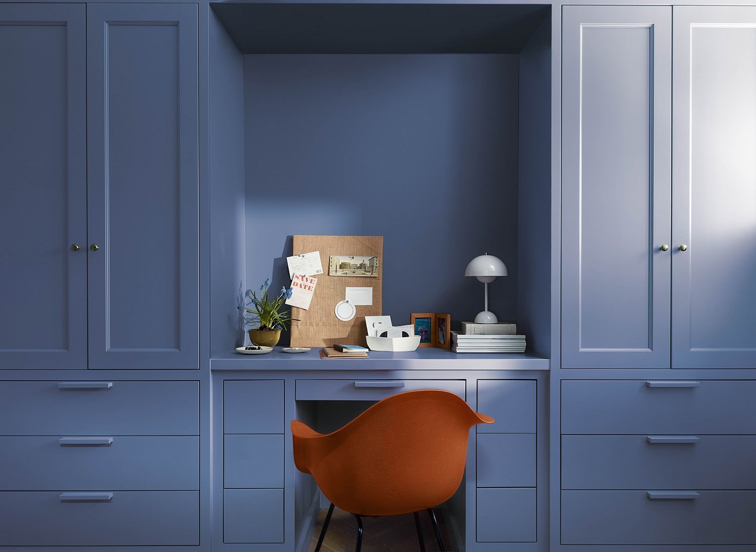
Benjamin Moore announces that Blue Nova is its Color of the Year 2024. It’s what the company calls an “out of this world,” mystical shade with just a slight hint of violet. Photo: Benjamin Moore

 A velvety hue with classic appeal, it’s a great alternative to navy. It’s an easy color and reminds me of a beautiful nighttime sky. But a new color to consider does not mean that we rush to have our home repainted just because of the hype surrounding it. It just gives us something to think about and to place on our inspiration board.

 My take on Blue Nova and how to use it

And there are many ways to bring Nova Blue into your home. Here are a few suggestions.

 ·       Use it in rooms with good natural light and incorporate accents including oranges, yellows, light blues. Think: sunset colors.

·       Paint an entire dining room in Blue Nova. Use White dove as your ceiling and trim color. Spectacular!

·       It’s perfect for a small powder room. Think: chrome, black, antique or gold fixtures.

·       Love it but not ready to commit? Use just a splash! Try this or any color that you love but aren’t sure about committing to a full room, by using it to highlight architectural features: molding, windows, doors.

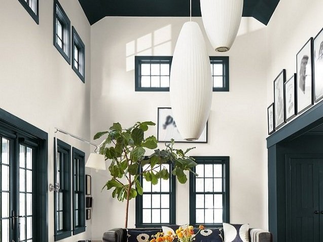
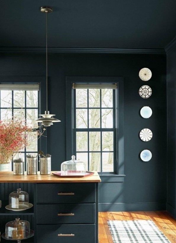
Try a color that you love by using it to highlight architectural features: molding, windows, doors and especially the ceiling. Shown: Benjamin Moore Regent Green. Photo: Benjamin Moore

·       Paint a bookcase including the back of the bookcase.

·       Paint the ceiling! It’s the fifth wall and under used. Just a splash on the ceiling may give you all the color you need/want.

·       Color drenching. If you haven’t heard, this is a huge trend. Paint everything in the same color. Everything. Ceilings, walls, woodwork. doors. Color drenching is for brave color warriors and if you are undecided, call a professional for input! 

Color drenching is the latest paint trend. Literally everything drenched in the same color. Only for those brave enough to try it! If you are undecided, call a professional for input.  Photo: Benjamin Moore

·       And if you love this or any color but don’t want to use it on your walls, try it in fabric for drapes or upholstery or pillows, wallcoverings, rugs, accessories.

Bright and cheerful, Benjamin Moore’s Honeybee from its Color Trends palette. Photo: Benjamin Moore

 ·       Paint the front door! Just in time for the holidays and picture your Christmas with Blue Nova as a backdrop. Beautiful.

 But wait there’s more (color)

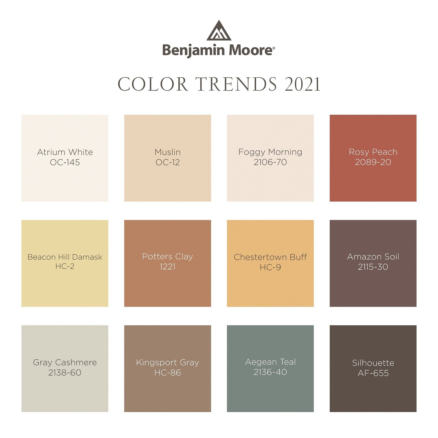
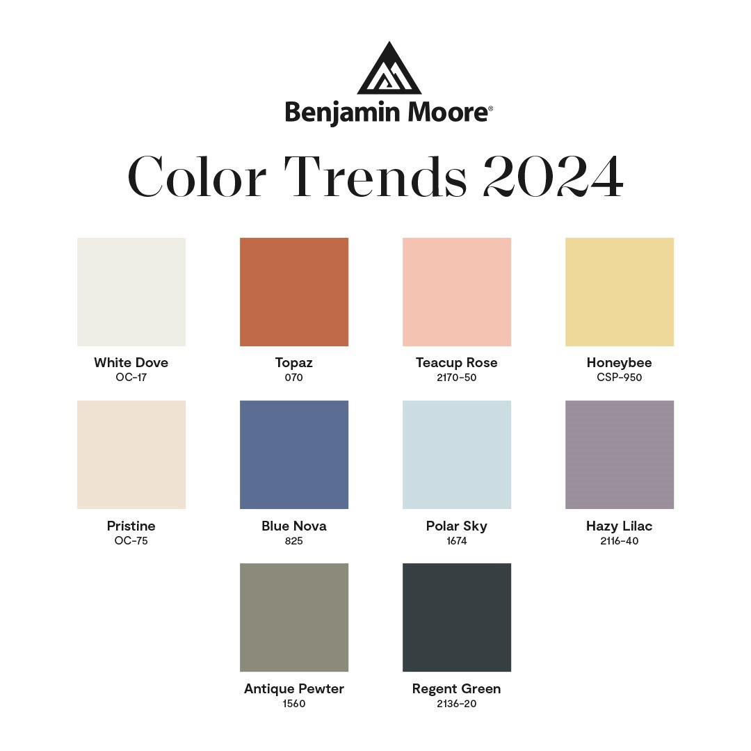
Benjamin Moore has also released its trending colors for blending traditional and modern design styles. It’s always fun to see some new colors that you may not have considered for your home. Even if it’s just for a new accessory. And such yummy names: White Dove, Topaz, Pristine, Teacup Rose, Honeybee, Regent Green, Hazy Lilac, Polar Shy and Antique Pewter.

 Why is color so important?

• It updates your home without spending a fortune.

• Pulls the space together.

• Makes your home look clean and fresh.

• Color creates a personalized look for your home.

• It makes you happy!

 A few more color tips

Creating a spectacular space in your home doesn’t just happen. It takes thought, effort, planning and careful implementation for a quality result. This is especially true when coming up with a color plan.

·       ALL color has undertones. This is where the mistakes are made. This is where a professional can help.

·       Think about the rest of your home. Color needs to coordinate throughout. A good rule that I follow: No more than three paint colors in the home.


Wrenda Goodwyn is a Southwest Florida interior decorator, A.S.I.D. associate and gold member of the Interior Redecorators Network. She helps homeowners throughout Southwest Florida with timeless, affordable ways to create beautiful spaces, color palettes and solve decorating problems. Her articles appear the first Saturday of each month. For more information, visit her website at spectacularspaces.com. Call her at 239-850-5800 or e-mail wrenda@spectacularspaces.com. For more decorating tips, articles and photos, visit spectacularspaces.com/blog


Color matters: how to get it right in your home

Wrenda Goodwyn • special to the Fort Myers News-Press/USA Today Network • Feb. 4, 2023

Creating a spectacular space in your home doesn’t just happen. It takes thought, effort, planning and careful implementation for a quality result. This is especially true when coming up with a color plan.

It’s far from easy. It’s complicated. It’s not necessarily about your favorite color. It’s why home interior professionals study it for years and most are like me and don’t leave the house without a fan deck in their hand. We are passionate about color. Color is everything.

As a Fort Myers interior decorator, my most requested service is selecting color and creating personalized color palettes for the home. It’s the most difficult part of decorating for many homeowners and there are good reasons. The number one reason being the approach. It’s usually all wrong and results in mistakes and frustration.

Collage display of what goes into coming up with a design plan. Photo by Benjamin Moore.

Creating a spectacular space in your home doesn’t just happen. It takes thought, effort, planning and careful implementation for a quality result. This is especially true when coming up with a color plan. Before you head out to pick up color swatches, come up with a plan that considers flooring, light, furnishings and upholstery throughout the home. Photo: Benjamin Moore

Most rush out to a big box store, grab a hundred color swatches (all in their favorite colors), take them home, hold the one-inch color swatch up to their existing paint color, make a decision, call the painter and it all begins. And then wonder why it doesn’t look just right.

Trends and changes

Although I always recommend following what you love and a more timeless approach to home decorating, color trends are always fun and there are lots of changes in color choices.

Timeless and classic white bathroom in Benjamin Moore's Ice Mist in matte and wainscoting in white Diamond matt.. Aura Bath and Spa.b

Timeless and classic. A white bathroom with walls in Benjamin Moore’s Ice Mist in matte and wainscoting in White Diamond matte. Aura Bath & Spa. Photo: Benjamin Moore.

• Overall we are seeing warmer colors. Cozy and comfort seem to be what we are craving right now.

• Lots of beautiful earth tones. Be careful of too much of a good thing. Remember how long it took to escape the Tuscan trend.

• Reds, oranges, yellows.

• Neutrals warmed up with yellows, blues and greens. This is a popular choice in Southwest Florida homes.

• Moody hues on walls in darker tones. And lots of navy for kitchen cabinets.

Beautiful bathroom in moody popular color by Benjamin Moore, Charcoal Slate with Atrium White trim. ebe

Moody colors are popular such as Benjamin Moore’s Charcoal Slate (walls in matte) and Atrium White (ceiling in matte), trim in semi-gloss. All are Aura Interior Paint. Photo: Benjamin Moore.

Timeless and classic

• White for kitchens and bathrooms.

• Moldings for the entire home. These classic touches give a room what it needs to carry off all-white or dark colors.

Rule #1

When we speak of color and color palettes, we are not suggesting that color only be considered for walls. Your color palette should incorporate the entire look of your home. If your primary color in your living spaces is neutral, the color palette should incorporate other colors throughout to keep it from being boring.

An example is yellow. We are seeing this color return and it is everywhere. But let’s face it: yellow is a tough wall color if you don’t want to tire of it soon. So, work yellow into your palette with towels, linens, fabric, wall treatments and accessories.

And this really goes for any color that you fall in love with. Just because you saw that dark blue in a magazine and you want to try it on your walls, think about it. Consider lighting, architectural features, furnishings, trims and how you use the room before you paint. Most of these rooms in magazines are decorated from top to bottom with custom trims and architectural features. It simply will not look the same in a plain room.

So, what do we do?

Incorporate these beautiful splashes of color throughout your home in other ways. Here are a few:

• Try the color on a ceiling. I have been doing this in homes for years and it gives a splash of color without committing it to the entire room.

• Paint shelves and bookcases in a color against a neutral background. Or go monochromatic with everything in the same color.

• Use colors from your palette in rugs, pillows, window treatments, headboards, upholstery for sofa, and chairs, artwork, mural or wallcovering.

Why is color so important?

• It updates your home without spending a fortune.

• Pulls the space together.

• Makes your home look clean and fresh.

• Color creates a personalized look for your home.

• It makes you happy!

A few more tips

ALL color has undertones. This is where the mistakes are made. If your sofa (or flooring or counter tops) has green/beige undertones and you pick a pinky beige paint color for walls, you will not be happy. This is where a professional can help.

• Think about the rest of your home. Color needs to coordinate throughout. A good rule that I follow: No more than three paint colors in the home.

• What works: I like to select more neutrals for the main areas and incorporate ceiling and trim colors. Bathrooms and bedrooms lend themselves to accent colors.

Wrenda Goodwyn is a Southwest Florida interior decorator, A.S.I.D. associate and gold member of the Interior Redecorators Network. She helps homeowners throughout Southwest Florida with timeless, affordable ways to create beautiful spaces and solve decorating problems. Her articles appear the first Saturday of each month. For more information, visit her website at spectacularspaces.com. Call her at 239-850-5800 or e-mail wrenda@spectacularspaces.com. For more decorating tips, articles and photos, visit spectacularspaces.com/blog

Finding comfort at home with color

Benjamin Moore Color of the Year 2021 Aegean Teal 2136-40. A blue-green with grey undertones, is soothing and tranquil with hints of the outdoors and nature. Walls: eggshell. Trim: Atrium White OC-145 in satin. Photo credit: Benjamin Moore

Benjamin Moore Color of the Year 2021 Aegean Teal 2136-40. A blue-green with grey undertones, is soothing and tranquil with hints of the outdoors and nature. Walls: eggshell. Trim: Atrium White OC-145 in satin. Photo credit: Benjamin Moore

Wrenda Goodwyn • special to the Fort Myers News-Press • Oct. 24, 2020

Before we know it, the election will be over. The holidays will be here. And we’ll be heading into a new year with optimism and hope as we say goodbye to a tumultuous 2020. It’s a time to reflect and reset. And there’s no better place to start than in our homes.

Benjamin Moore just announced its Color of the Year, Aegean Teal 2136-40 and the corresponding Color Trends 2021 palette. The colors have a welcoming, lived-in quality that is comforting, uplifting and inspiring. Colors that we can really use in our homes.

Cabinets: Benjamin Moore Color of the Year 2021 Aegean Teal 2136-40 in satin finish; walls: Aegean Teal 2136-40 in eggshell; trim: Gray Cashmere 21385 in satin. Photo credit: Benjamin Moore

Cabinets: Benjamin Moore Color of the Year 2021 Aegean Teal 2136-40 in satin finish; walls: Aegean Teal 2136-40 in eggshell; trim: Gray Cashmere 21385 in satin. Photo credit: Benjamin Moore

“Amid uncertainty, people yearn for stability. The colors we surround ourselves with can have a powerful impact on our emotions and wellbeing,” says Andrea Magno, Benjamin Moore director of color marketing & development.”

As Southwest Florida interior decorator, I’m designing more color palettes for my clients than ever before. Whether during an in-home consultation or virtually, everyone seems to be looking for a color refresh. As someone who lives, sleeps and breathes color, I’ve always believed that popular color trends somewhat reflect what is happening in the world and what we need.

Love this color and want to start out with an accent? Try the inside of a cabinet. Inside cabinet: Aegean Teal 2136-40in semi-gloss; cabinet exterior: Chestertown Bluff HC-9 in semi-gloss. Photo credit: Benjamin Moore

Love this color and want to start out with an accent? Try the inside of a cabinet. Inside cabinet: Aegean Teal 2136-40 in semi-gloss; cabinet exterior: Chestertown Bluff HC-9 in semi-gloss. Photo credit: Benjamin Moore

And it’s no surprise since our homes have never had to work so hard serving as an office, workout space, restaurant, classroom, library and more.

Thoughts about Aegean Teal

My clients know that I advise against following a color trend just for the sake of the trend. But they can be fun and bring a little energy to a room that needs refreshing.

Full disclosure, I love this color. The blue-green with grey undertones, is perfect for our Florida location near the Gulf of Mexico. It’s soothing and tranquil. Inviting. Hints of the outdoors and nature. There’s a harmony and a calm to it.

The entry, dining and living room coffered ceilings in my own home were painted with Aegean Teal 2136-40 and the walls seen here are Silver Satin 856.

I love this color so much I used it in the coffered ceilings of my own home and had a living room sofa upholstered to match, two years ago. It still gives me happiness.

I have this color in my own home. Two years ago, I had the coffered ceilings in my entry, dining and living room painted in this color. The walls are Benjamin Moore’s Silver Satin 856. I wanted just enough of this beautiful color to provide an accent. I like it so much that I had a sofa upholstered in the same color in my living room.

And here we are two years later and I still love it. Why? It gives me joy. It’s pure happiness every day. That’s what I want from a color: happiness. And it’s what I want for your home.

Benjamin Moore Color Trends 2021 palette including Muslin OC-12, Rossy Peach 2089-20, Beacon Hill Damask HC-2, Amazon Soil 2115-30 and Kingsport Gray HC-86, among others.

And if Aegean Teal does not work, check out the other 11 colors in the Color Trends 2021 palette. Described as having sunbaked qualities, they include Atrium White OC-145, Muslin OC-12, Foggy Morning 2106-70, Rosy Peach 2089-20, Beacon Hill Damask HC-2, Potters Clay 1221, Chestertown Buff HC-9, Amazon Soil 2115-30, Gray Cashmere 2138-60, Kingsport Gray HC-86, and Silhouette AF-655.

How to use Aegean Teal in your home

Just because you like a color does not mean that it has to (or necessarily should) go on the walls. There are many ways to incorporate color into your space. For Aegean Green, a few suggestions: front door, powder room, kitchen or bathroom cabinets, kitchen island, shelves or a bookcase in a high gloss, the back wall of a bookcase, wallcoverings, side table, ceilings, trim and baseboards, accessories, fabric, rug.

Daybed painted in Aegean Teal 2136-40 with fresh linen duvet and pillow shams in soft neutral tones and gray throw blanket by Muslin OC-12 flat wall.

Use Aegean Teal 2136-40 in satin for a window seat or piece of furniture. Walls shown are Muslin OC-12 flat. Photo credit: Benjamin Moore

It’s a fact that making a color change in your home is the biggest change you can make for your decorating budget. Note these tips when creating a new color palette:

Color don’ts

• Rush to make a decision

• Pick color from a tiny swatch

• Paint without testing the color on the wall

• Pick a paint color before you have anything else in the room

• Think only about the room that you are painting. Color needs to flow in order to work.

• Paint every room a different color.

Color do’s

• Create a color palette and work from there. Consider your window treatments, upholstery, pillows, artwork and accessories.

• Buy the best quality paint you can afford. It makes a difference. And go with the lowest VOC or no VOC.

• Color challenged? Magazines, Pinterest and vision boards all help.

• When all else fails, call a professional. Our job is to keep you from making mistakes.

We still have a couple of months before we say goodbye to 2020. This is a good time to begin planning your strategy for reenergizing your home.

Aegean Teal - Copy.png

Wrenda Goodwyn is a Southwest Florida interior decorator, A.S.I.D. associate and gold member of the Interior Redecorators Network. She helps homeowners throughout Southwest Florida with timeless, affordable ways to create beautiful spaces and solves decorating problems. Her articles appear the first Saturday of each month. For more information visit her website at spectacularspaces.com. Call her at 949-1808 or e-mail wrenda@spectacularspaces.com. For more decorating tips, articles and photos, visit spectacularspaces.com/blog

Thinking about pink: 2020 Color of the Year

Wrenda Goodwyn • special to the Fort Myers News-Press • October 26, 2019

It’s a good day to think about pink.

If you’ve been craving something pink in your palette, but have been afraid to make a commitment, this could be it. Living room accent wall with Benjamin Moore First Light 2102-70 on walls; White Heron OC-57 ceiling. Photo: Benjamin Moore

If you’ve been craving something pink in your palette, but have been afraid to make a commitment, this could be it. Living room accent wall with Benjamin Moore First Light 2102-70 on walls; White Heron OC-57 ceiling. Photo: Benjamin Moore

Actually, think about that pretty dusty glow first thing in the morning when the sun is coming up. Before the hot, Florida sun has brightened everything up. That’s First Light 2102, Benjamin Moore’s Color of the Year 2020.

Let’s face it: pink has been a popular, trending color for several years. In fashion (I give you Lilly Pulitzer), accessories and paint. We see lots of pink in Southwest Florida. Especially at the beaches. Every time I go to the beach I pass a beautiful pink home on the beach with the blue gulf behind it. I’m certain that I was meant to live in that home.

Photo: Benjamin Moore

Photo: Benjamin Moore

These color of the year announcements from paint companies are fun and playful. Not to be taken too seriously. It doesn’t mean that you are meant to redo your home every time a new color is highlighted. It’s just something to consider that you may not have when refreshing your home.

As a Southwest Florida interior designer, my job is to help my clients select what they like. Not what is trending. I present choices that are best for their home within the guidelines of what they like. We make it all flow together when creating a color palette. Get the color right and you will have a happy home. Miss the mark and something will always seem off.

My take on First Light 2102

It’s a happy color. Not sugary sweet.

A fun neutral between cool and warm. It’s should not be taken too seriously. This is not an in-your-face color.

To me, it presents an alternative to white or beige that is modern and refreshing.

It plays well with other colors. Some examples:

Colors that work well with First light. Photo: Benjamin Moore

Colors that work well with First light. Photo: Benjamin Moore

If you have been craving something pink in your palette, but have been afraid to make a commitment, this could be it.

How to use it

I love this color for ceilings and trim. Pair it with Decorator’s White or Simply White on the walls in a bedroom or dining room and you have a gorgeous room.

When selecting color, I always go with colors that are found in nature. This one certainly is, so don’t be afraid of it. A bathroom, living room or office that need a change would be perfect.

Bedding, pillows, accessories, window treatments in a white room.

Photo: Benjamin Moore

Photo: Benjamin Moore

Give it a test run as an accent color. Or a throw for your bed or sofa.

A new decade

“We selected First Light 2102-70 as our Color of the Year 2020 to represent a new dawn of idealism, design and living,” said Andrea Magno, Benjamin Moore Director of Color Marketing and Development. "First Light 2102-70 reflects a new definition of the home – a shift in mindset from the material to satisfying the core needs in life: community, comfort, security, self-expression, authenticity and ultimately, optimism.”

I think we could all use a strong dose of comfort and optimism. If First Light can give us that, I am all for it!


Wrenda Goodwyn is a Southwest Florida interior decorator, A.S.I.D. associate and gold member of the Interior Redecorators Network. She helps homeowners throughout Southwest Florida with timeless, affordable ways to create beautiful spaces and solves decorating problems. Her article appears the first Saturday of each month. For more information visit her website at spectacularspaces.com. Call her at 949-1808 or e-mail wrenda@spectacularspaces.com. For more decorating tips, articles and photos, visit spectacularspaces.com/blog