Moody blues and other trending colors for home interiors
/Wrenda Goodwyn • special to the Fort Myers News-Press/USA Today Network Nov. 11, 2023
Coming up with creative color palettes is pure joy for this Southwest Florida interior decorator. I love nothing more than to walk through a home getting to know the space and people who live there, and giving them a color plan that will provide happiness every time they walk in the door.
Just when I think I have used every possible color combination that includes a variation on the color blue for my area clients, Benjamin Moore pulls out another option for the blues.
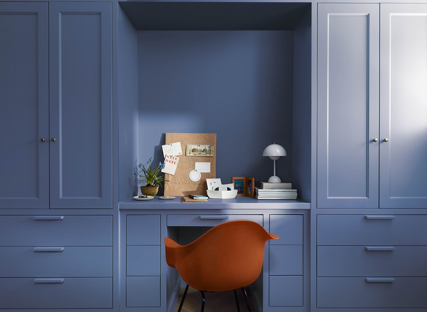
It’s always fun to see what paint companies come up with for their Color of the Year. And this year is no exception with Benjamin Moore’s Blue Nova 825. It’s what the company calls an “out of this world,” mystical shade with just a slight hint of violet. Its inspiration comes from “the brilliance of a new star formed in space,” according to the company.
Benjamin Moore announces that Blue Nova is its Color of the Year 2024. It’s what the company calls an “out of this world,” mystical shade with just a slight hint of violet. Photo: Benjamin Moore
A velvety hue with classic appeal, it’s a great alternative to navy. It’s an easy color and reminds me of a beautiful nighttime sky. But a new color to consider does not mean that we rush to have our home repainted just because of the hype surrounding it. It just gives us something to think about and to place on our inspiration board.
My take on Blue Nova and how to use it
And there are many ways to bring Nova Blue into your home. Here are a few suggestions.
· Use it in rooms with good natural light and incorporate accents including oranges, yellows, light blues. Think: sunset colors.
· Paint an entire dining room in Blue Nova. Use White dove as your ceiling and trim color. Spectacular!
· It’s perfect for a small powder room. Think: chrome, black, antique or gold fixtures.
· Love it but not ready to commit? Use just a splash! Try this or any color that you love but aren’t sure about committing to a full room, by using it to highlight architectural features: molding, windows, doors.
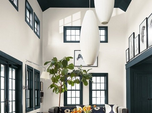
Try a color that you love by using it to highlight architectural features: molding, windows, doors and especially the ceiling. Shown: Benjamin Moore Regent Green. Photo: Benjamin Moore
· Paint a bookcase including the back of the bookcase.
· Paint the ceiling! It’s the fifth wall and under used. Just a splash on the ceiling may give you all the color you need/want.
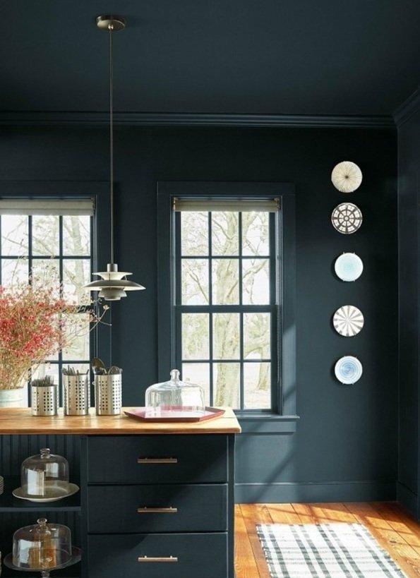
· Color drenching. If you haven’t heard, this is a huge trend. Paint everything in the same color. Everything. Ceilings, walls, woodwork. doors. Color drenching is for brave color warriors and if you are undecided, call a professional for input!
Color drenching is the latest paint trend. Literally everything drenched in the same color. Only for those brave enough to try it! If you are undecided, call a professional for input. Photo: Benjamin Moore
· And if you love this or any color but don’t want to use it on your walls, try it in fabric for drapes or upholstery or pillows, wallcoverings, rugs, accessories.
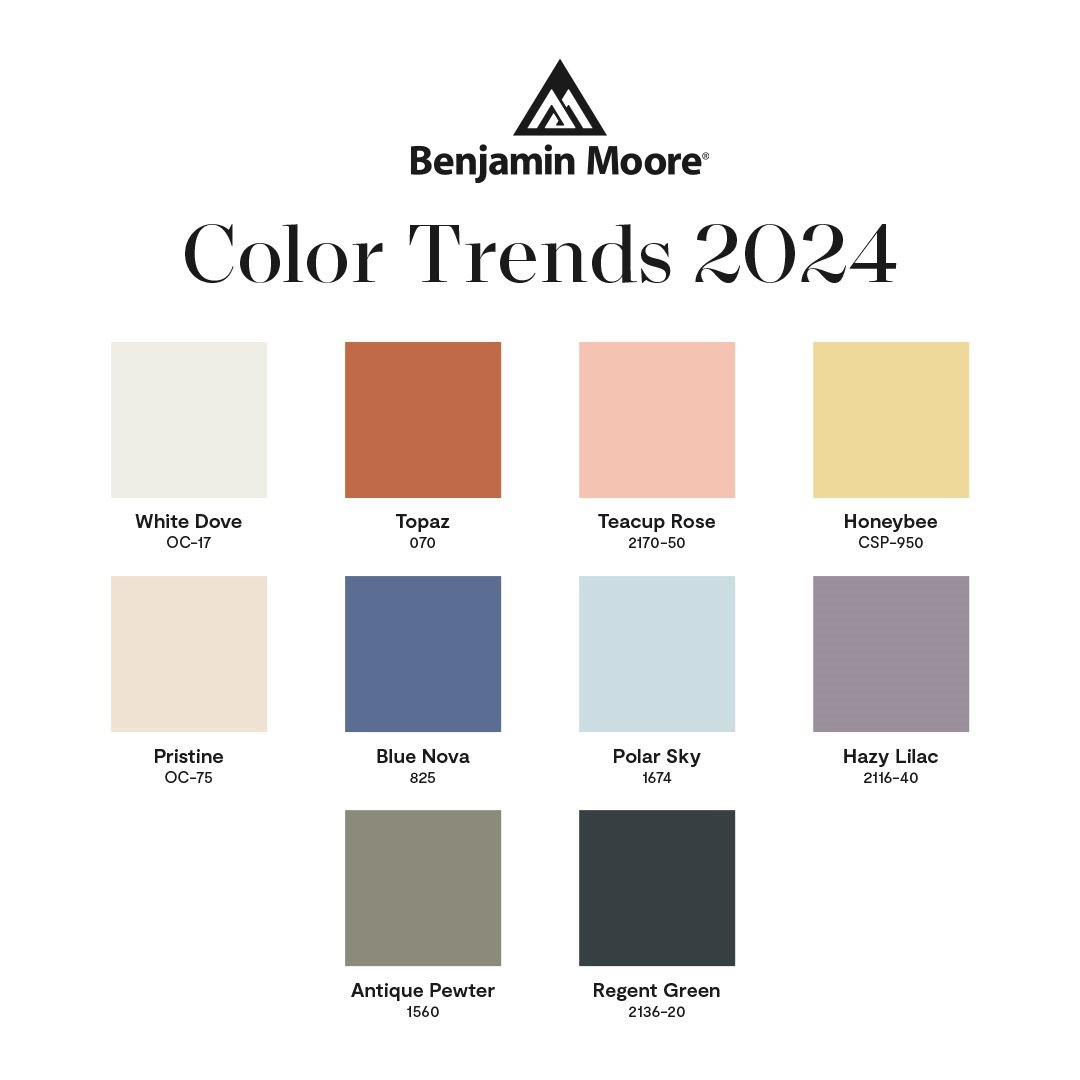
Bright and cheerful, Benjamin Moore’s Honeybee from its Color Trends palette. Photo: Benjamin Moore
· Paint the front door! Just in time for the holidays and picture your Christmas with Blue Nova as a backdrop. Beautiful.
But wait there’s more (color)
Benjamin Moore has also released its trending colors for blending traditional and modern design styles. It’s always fun to see some new colors that you may not have considered for your home. Even if it’s just for a new accessory. And such yummy names: White Dove, Topaz, Pristine, Teacup Rose, Honeybee, Regent Green, Hazy Lilac, Polar Shy and Antique Pewter.
Why is color so important?
• It updates your home without spending a fortune.
• Pulls the space together.
• Makes your home look clean and fresh.
• Color creates a personalized look for your home.
• It makes you happy!
A few more color tips
Creating a spectacular space in your home doesn’t just happen. It takes thought, effort, planning and careful implementation for a quality result. This is especially true when coming up with a color plan.
· ALL color has undertones. This is where the mistakes are made. This is where a professional can help.
· Think about the rest of your home. Color needs to coordinate throughout. A good rule that I follow: No more than three paint colors in the home.
Wrenda Goodwyn is a Southwest Florida interior decorator, A.S.I.D. associate and gold member of the Interior Redecorators Network. She helps homeowners throughout Southwest Florida with timeless, affordable ways to create beautiful spaces, color palettes and solve decorating problems. Her articles appear the first Saturday of each month. For more information, visit her website at spectacularspaces.com. Call her at 239-850-5800 or e-mail wrenda@spectacularspaces.com. For more decorating tips, articles and photos, visit spectacularspaces.com/blog


